
Beam — Lighting Brand Identity
Overview
About
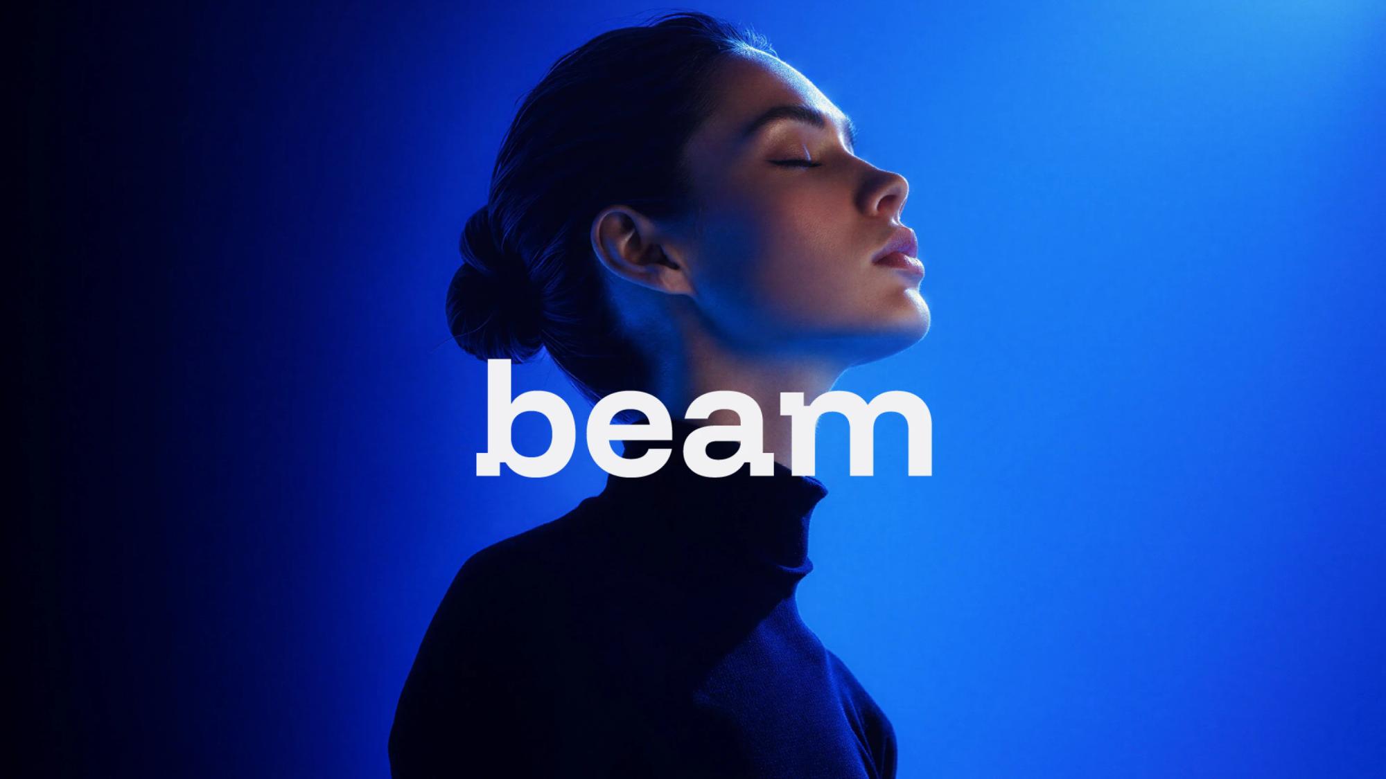
Beam is a lighting brand focused on creating thoughtful lighting solutions that enhance the way people experience spaces.
The brand needed a distinctive and contemporary logo that would feel modern and design-led while remaining warm, approachable and human.
Brief
Design a logo for Beam that reflects the brand’s focus on light, space and human experience.
The direction needed to feel clean, modern and confident without appearing overly technical, corporate or traditionally luxurious. The logo also needed to work effectively across different sizes and applications, from digital interfaces to physical materials.
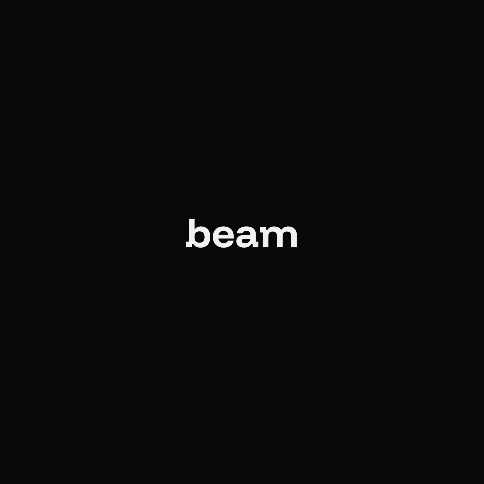
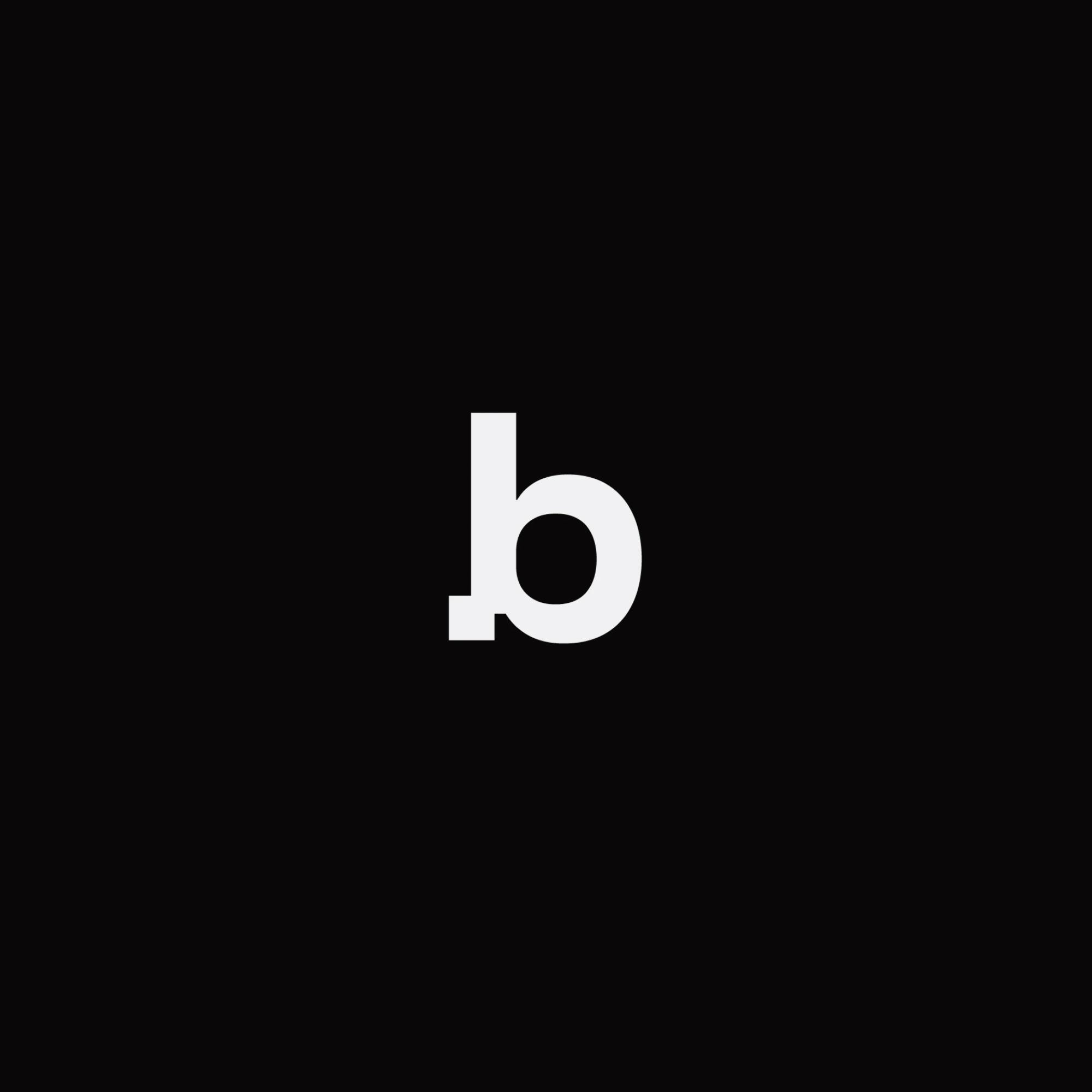
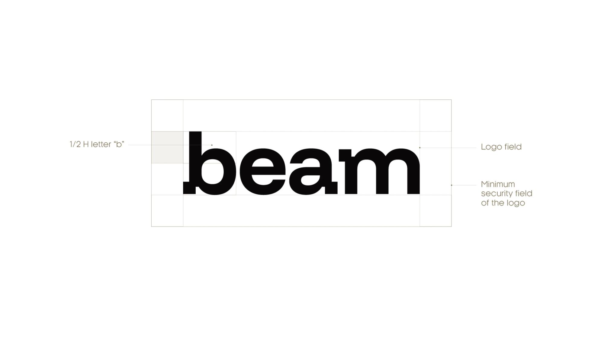
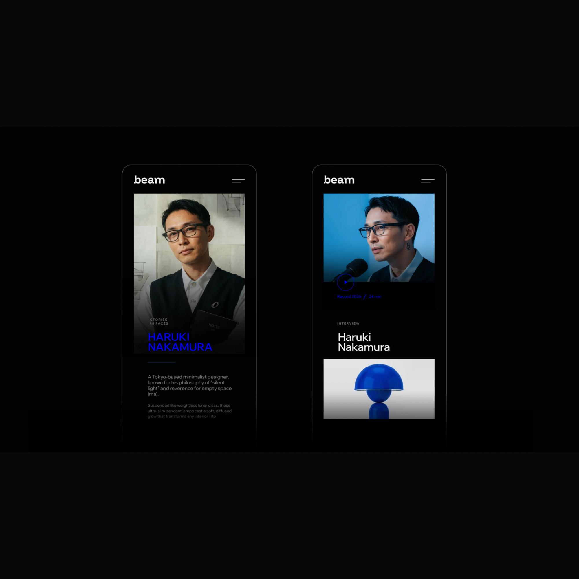
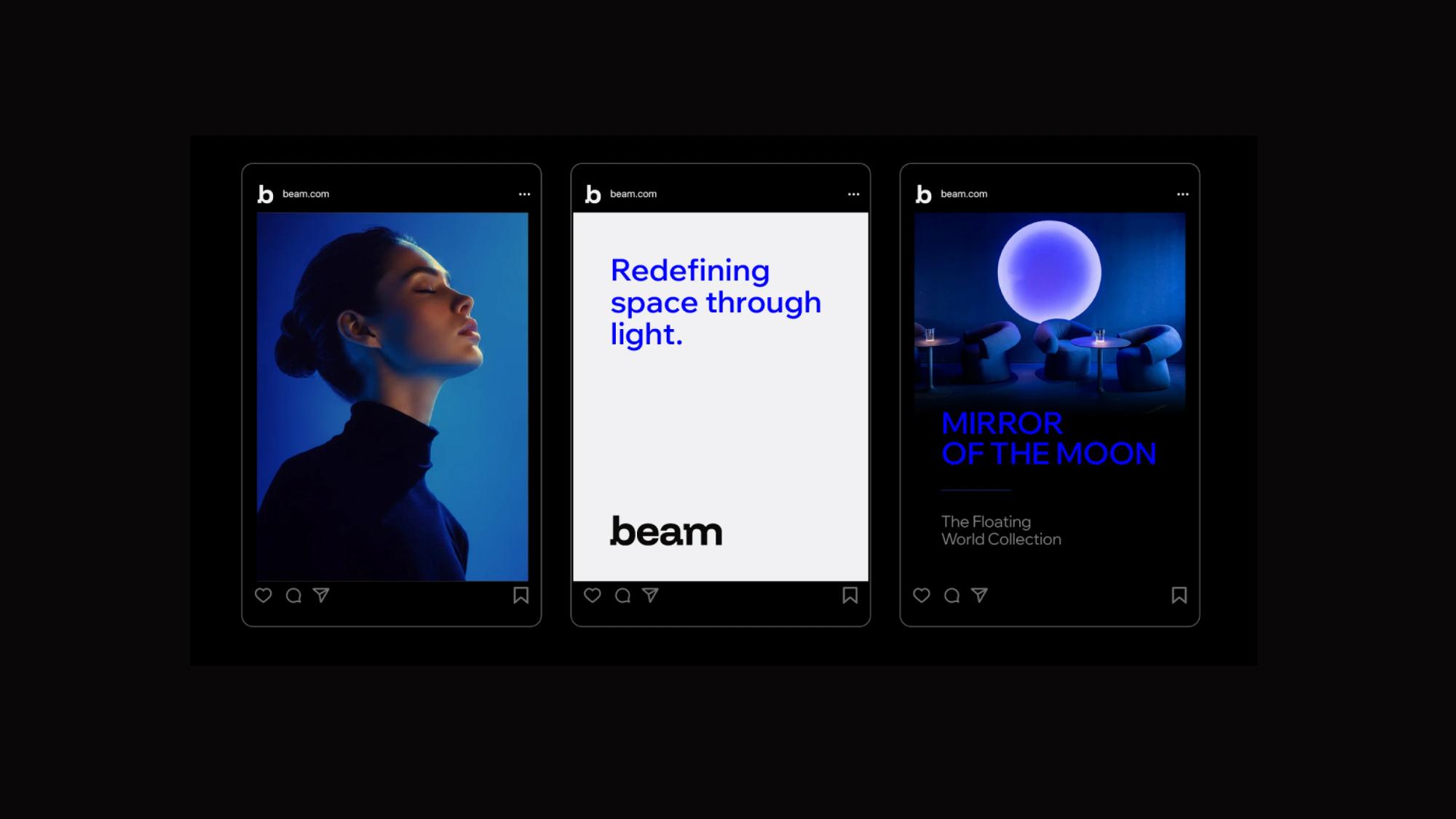
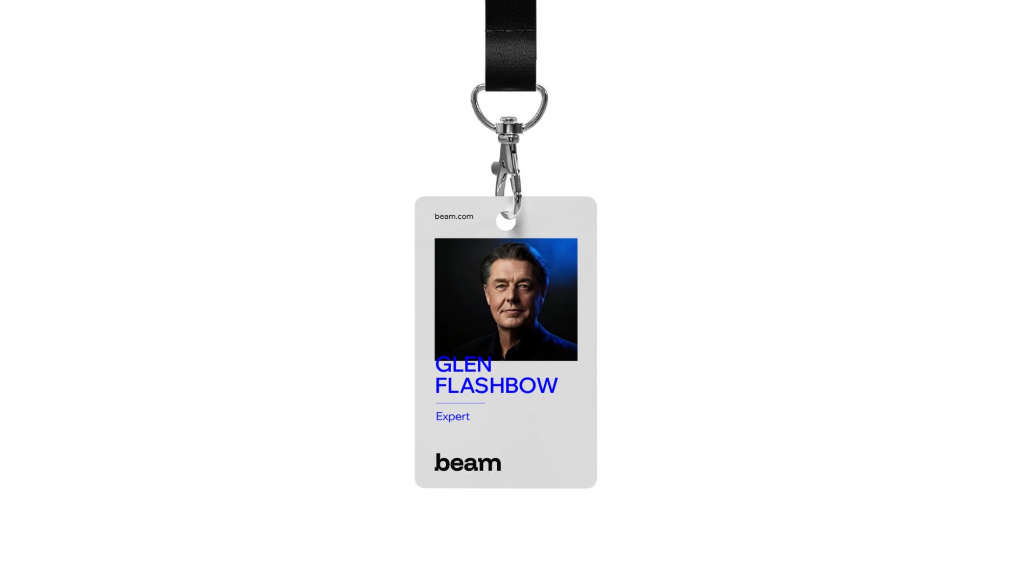
The final direction combines a refined wordmark with a distinctive “b” symbol, creating a simple and recognisable visual signature for the brand.
Client
Tamara Alireza
What we did
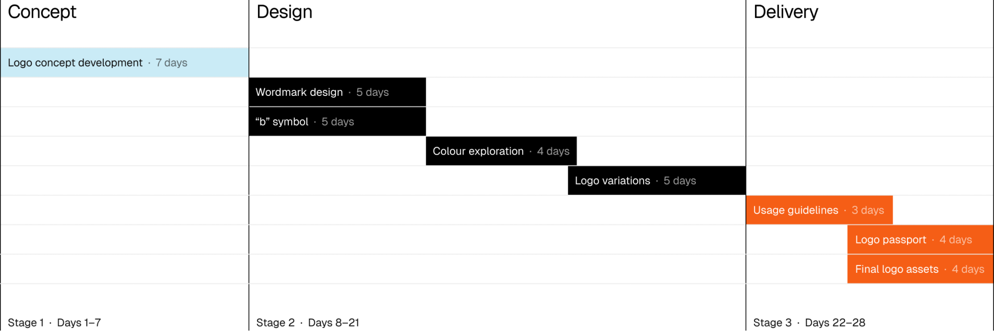
- Logo concept development
- Wordmark design
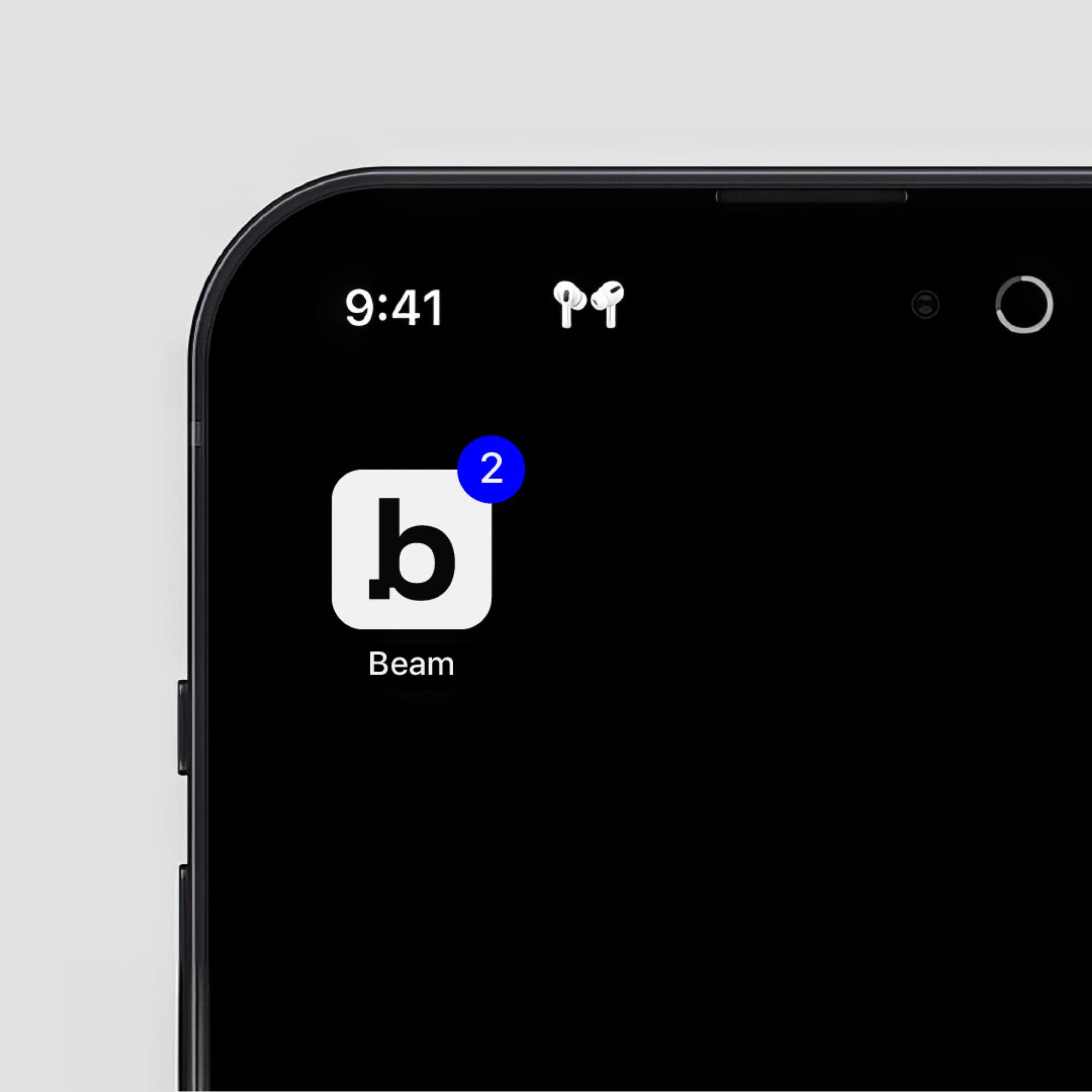
- Brand mark / “b” symbol
- Colour exploration
- Logo variations
- Logo usage guidelines
- Logo passport
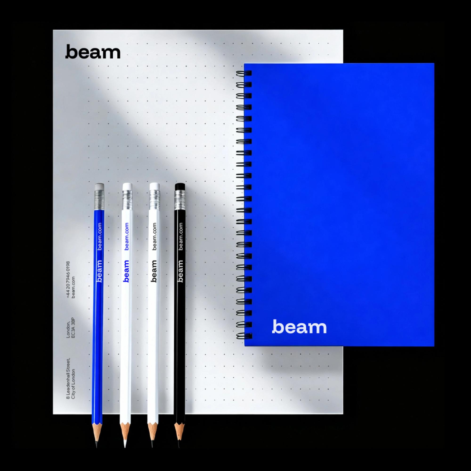
- Final logo assets for digital and print
Workflow
Result
Outcome
Feedback
Huge thanks for everything! I’m really happy with how the Beam branding has come together, and I truly appreciate all the hard work, patience, and attention to detail that went into getting it to this stage. It’s been an absolute pleasure working together, and I’ll definitely be in touch when I'm ready to move forward with the next steps!
Have a clear brief
or just an early idea?
Reach out either way. We’ll help you structure your thoughts, define the task, and bring your project to life.