
Mardyaa — Luxury Fashion Shopify E-Commerce Design
Overview
About
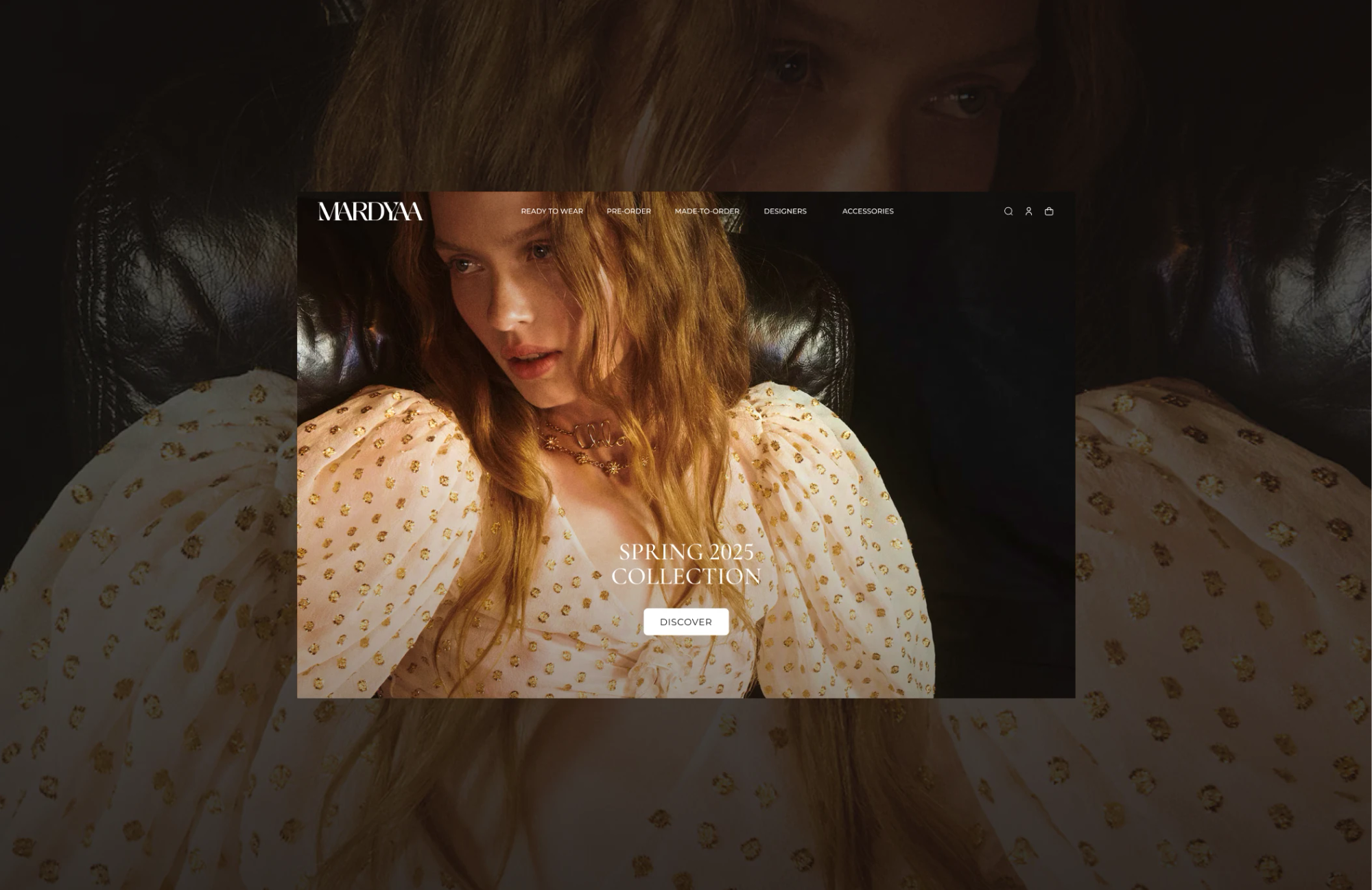
Mardyaa is a luxury boutique in New York. It sells designer clothes from all over the world, including made-to-order pieces and pre-season drops you usually can’t find in shops yet. Regular clients can join The ACCESS, the boutique’s members’ club, and get personal styling, cash back on purchases and free delivery.
They came to us for a new Shopify store. The idea was easy to say and hard to do: the site should feel like walking into the boutique, not like scrolling through a marketplace.
Brief
The catalogue is big and mixed: many designers, lots of sizes, pre-orders and pieces made to order. The club also needed a home online, where members can book a stylist, check their perks and follow their orders.
Our job was to fit all of this into a store that still looks calm and expensive, and that actually sells.
Client
Mardyaa — luxury fashion boutique, New York, USA
What we did
- CRO strategy & UX audit
- Information architecture
- High-fidelity wireframes
- UI/UX design for desktop & mobile
- Design system & UI kit
- Custom Shopify theme design
Key design decisions
Filters that stay out of the way
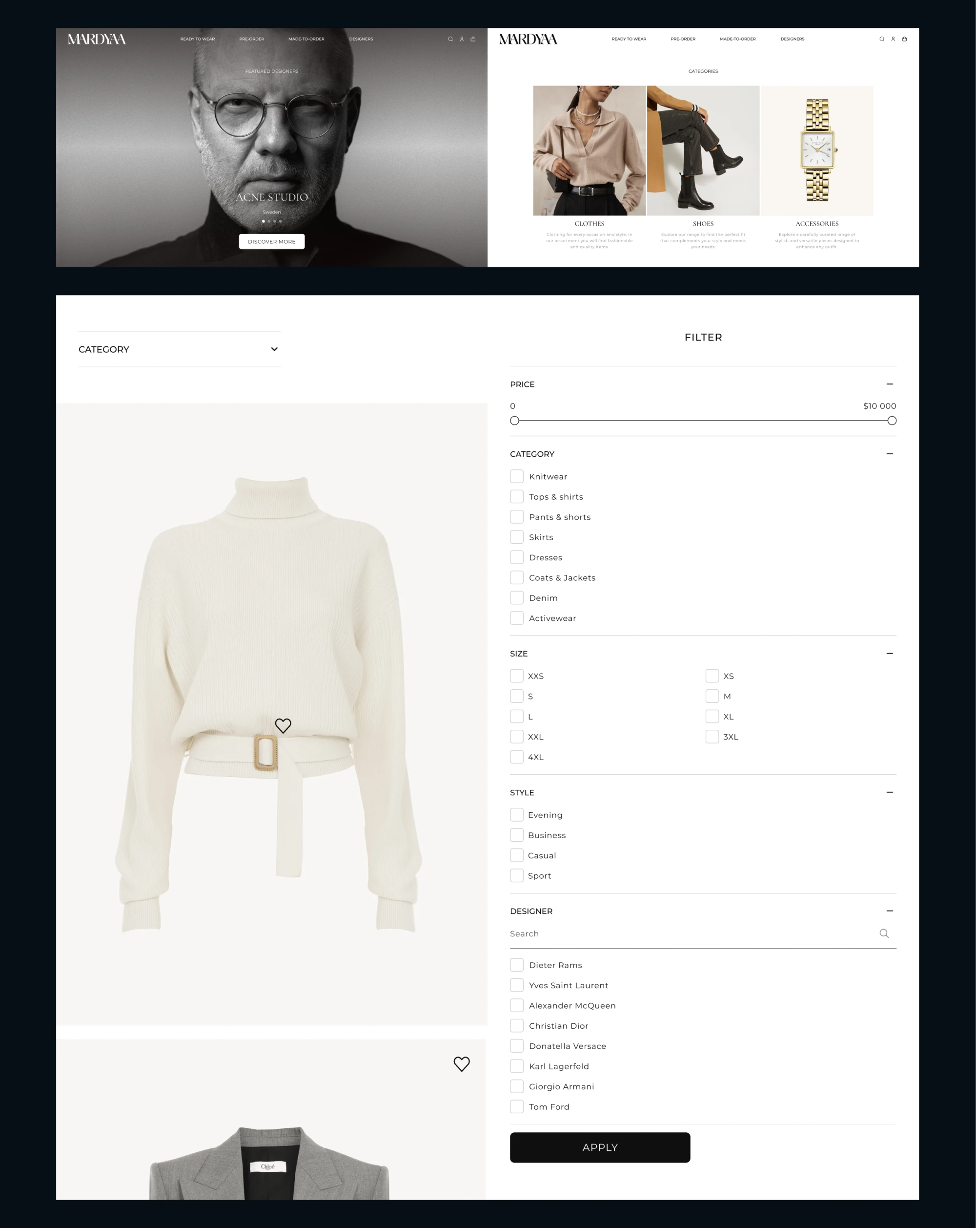
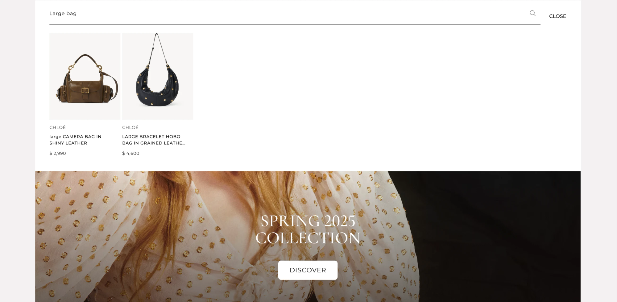
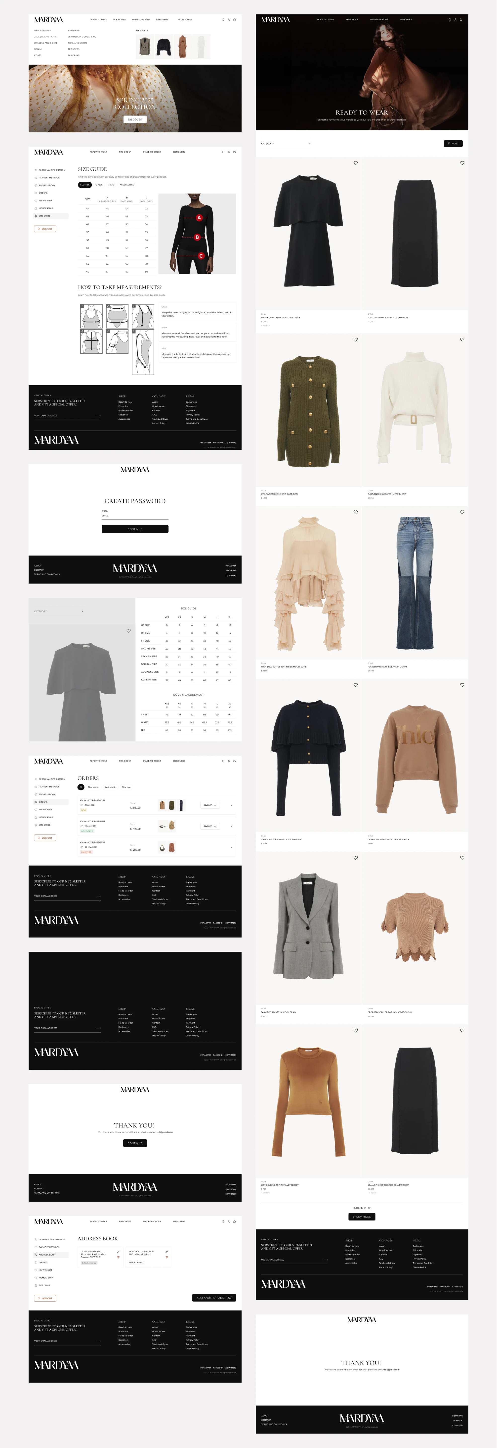
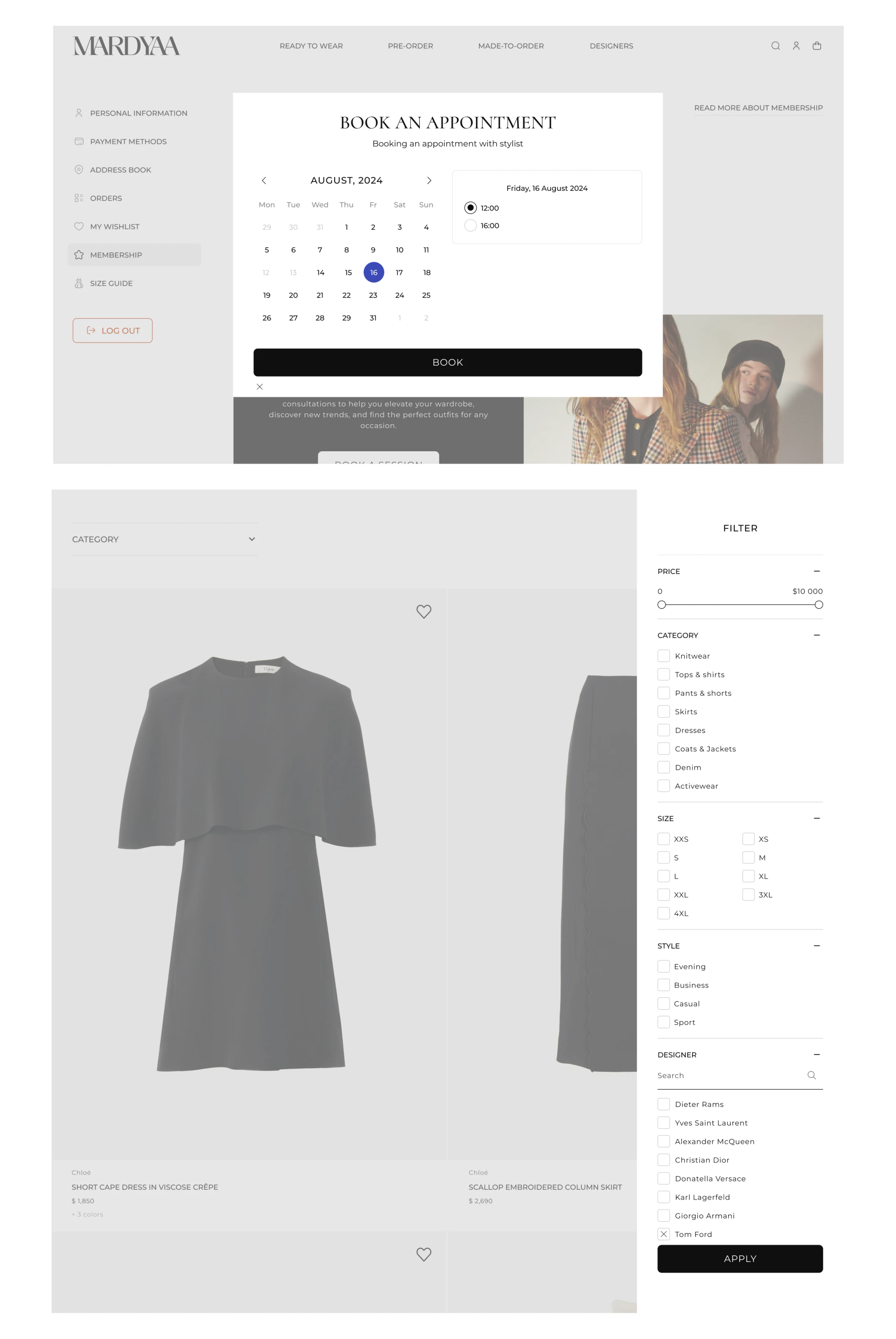
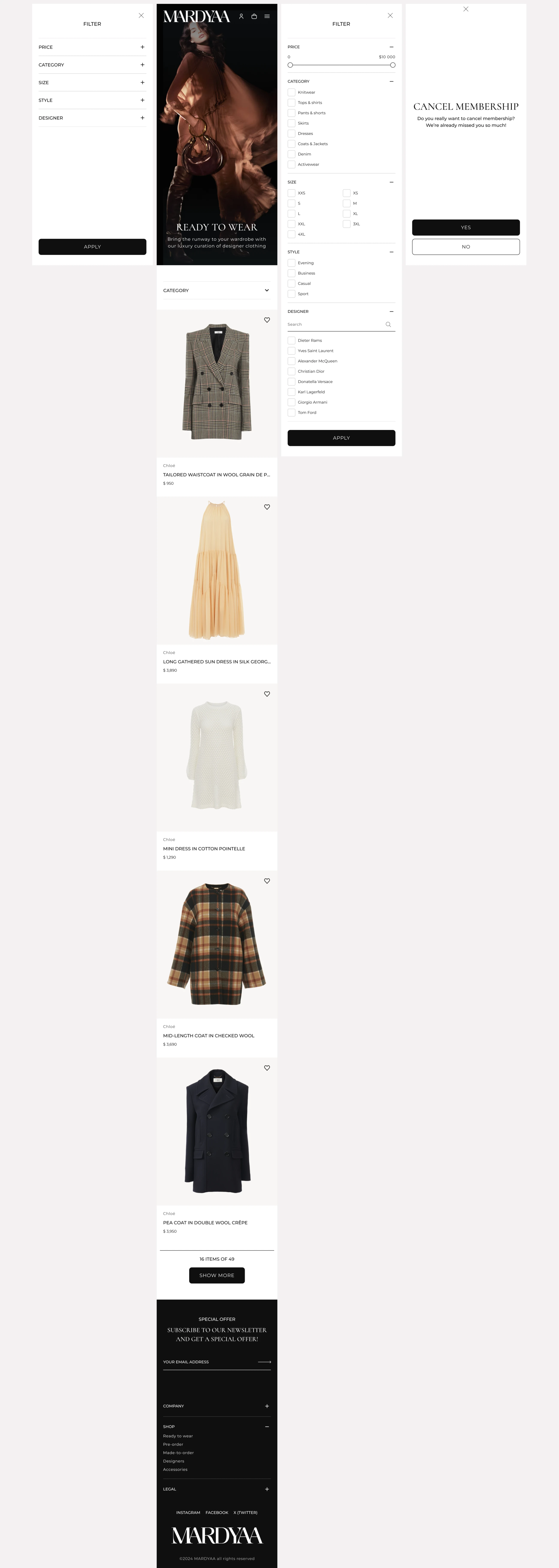
Shoppers on a site like this usually know what they want: a size, a price range, a favourite designer. We put every filter into one side panel that stays quiet until you need it. A few clicks and the catalogue is down to the right pieces, and the clothes never disappear behind the controls.
Shopping by designer
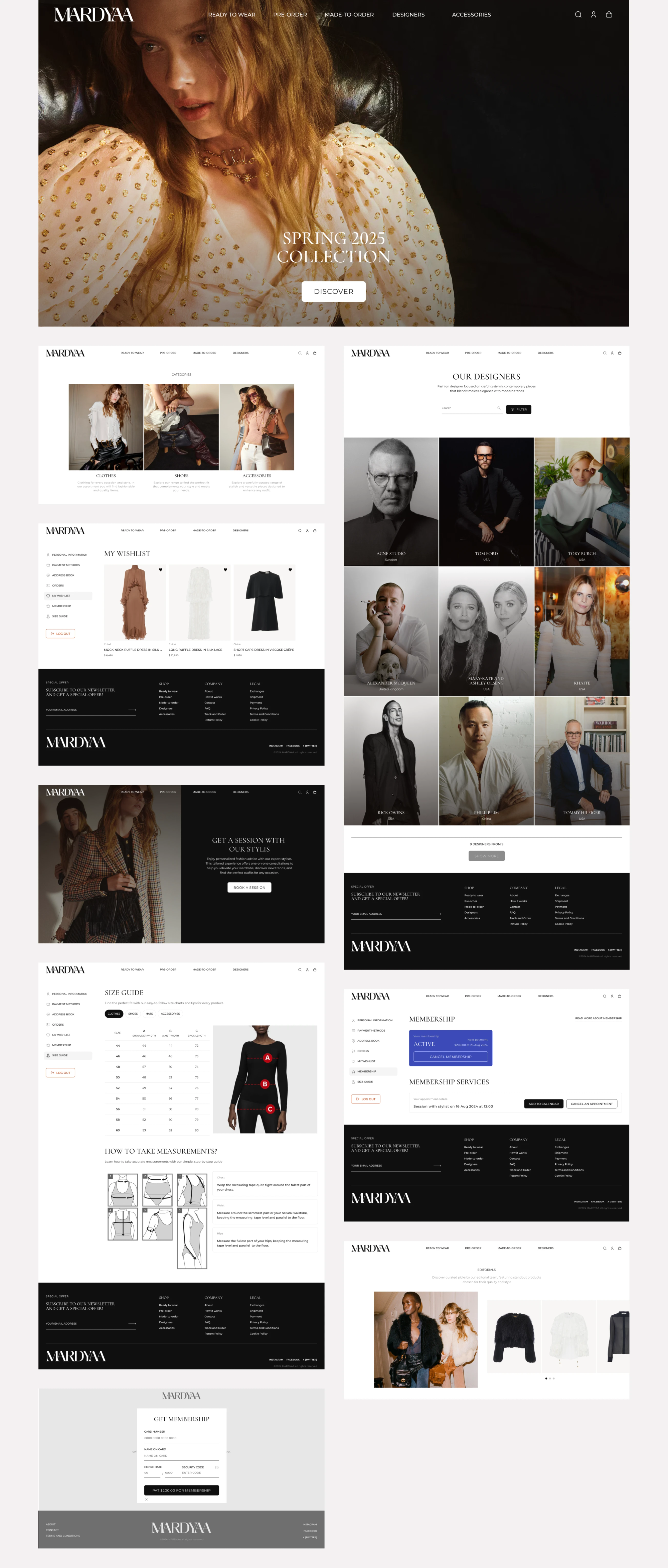
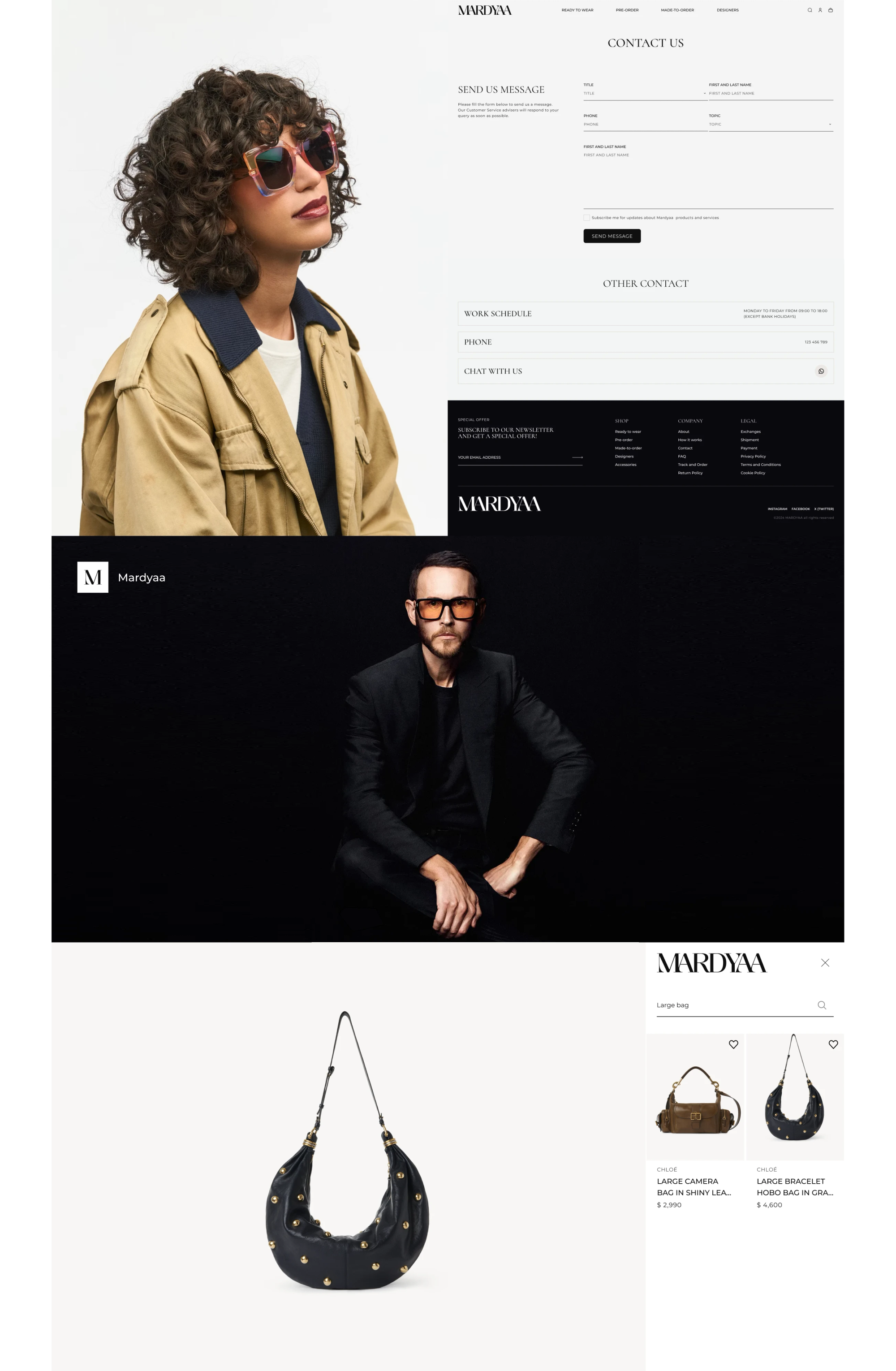
For many luxury buyers the label matters more than the category. So designers got their own index page with portraits. It makes the brands feel personal and lets loyal clients go straight to the names they follow.
Product pages that sell the look
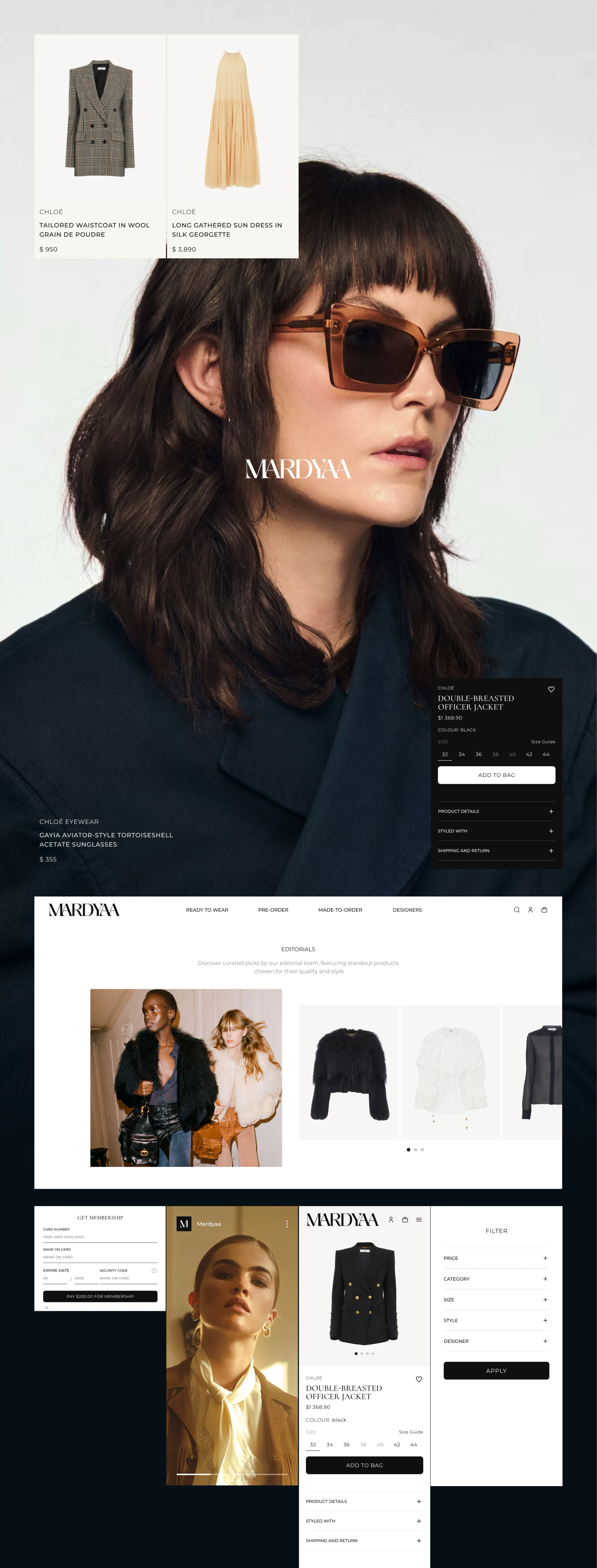
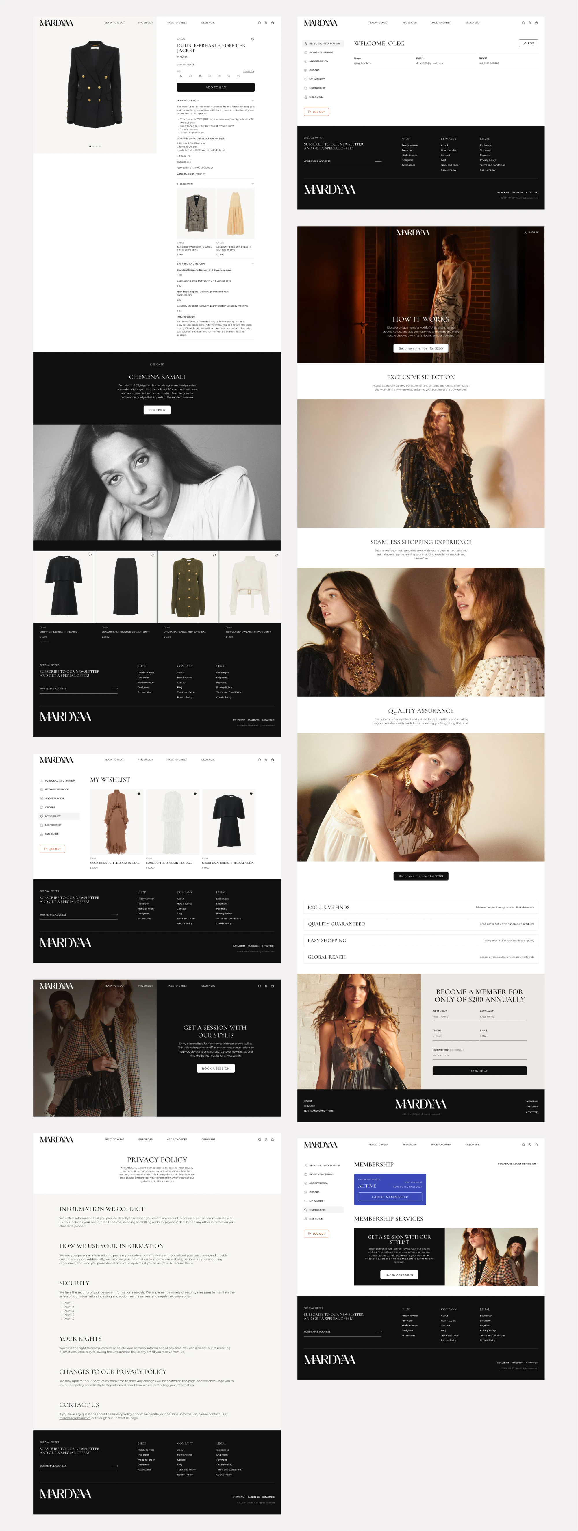
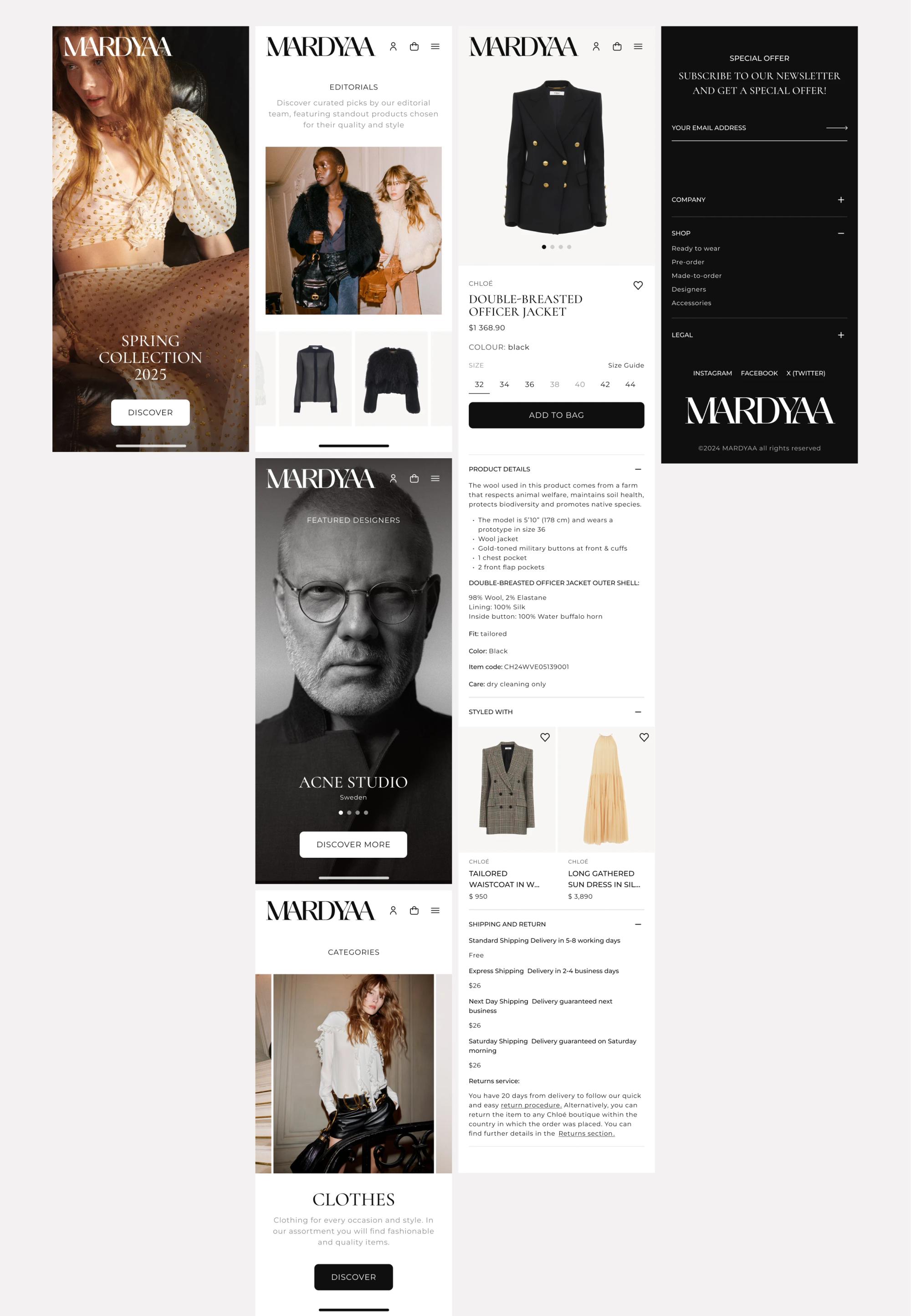
Big editorial photos come first. Fabric, care and fit details are tucked into accordions, so the page never turns into a wall of text. A "Styled with" row suggests pieces that go together, and delivery terms sit right next to the price, which is exactly where people look for them.
A members’ area, not just an account
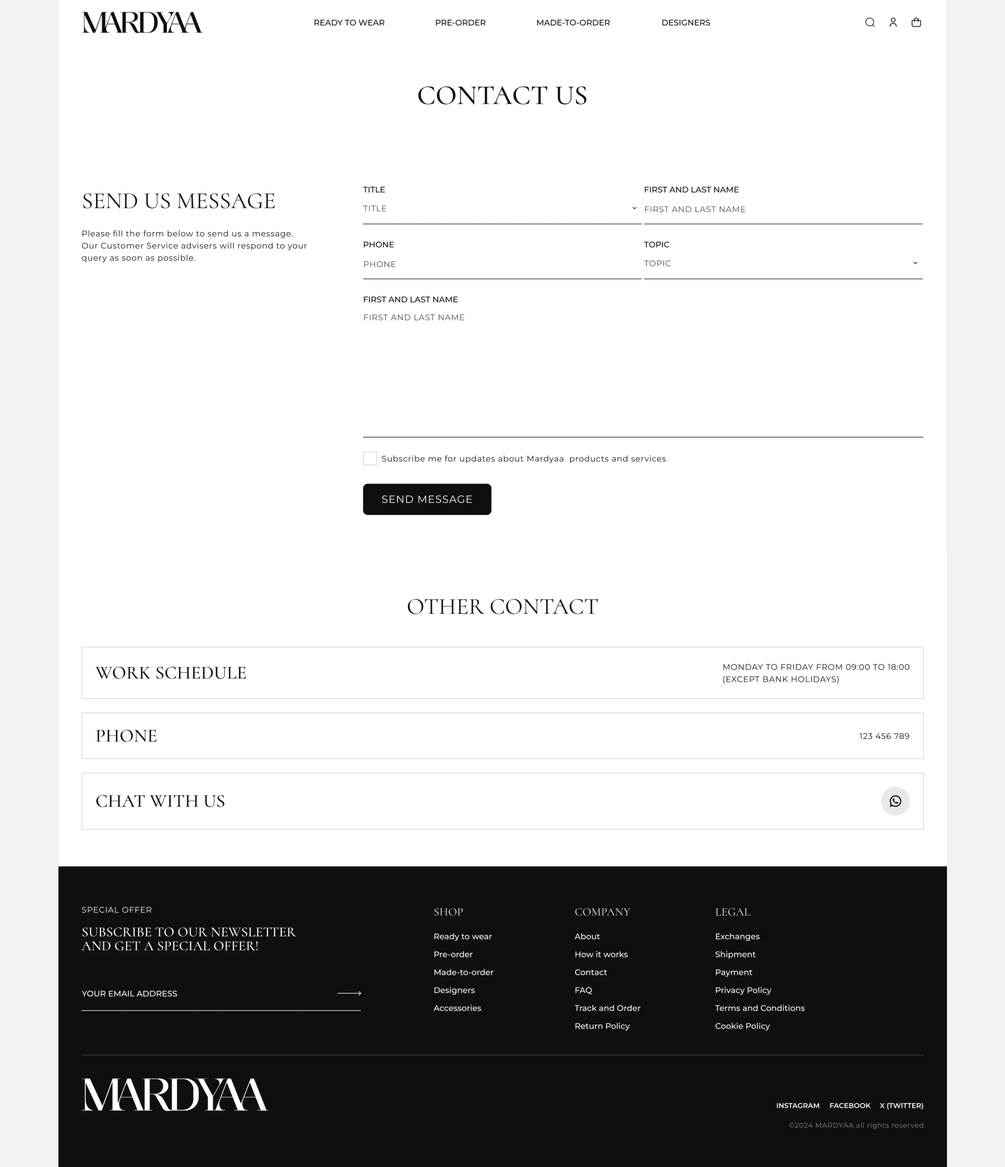
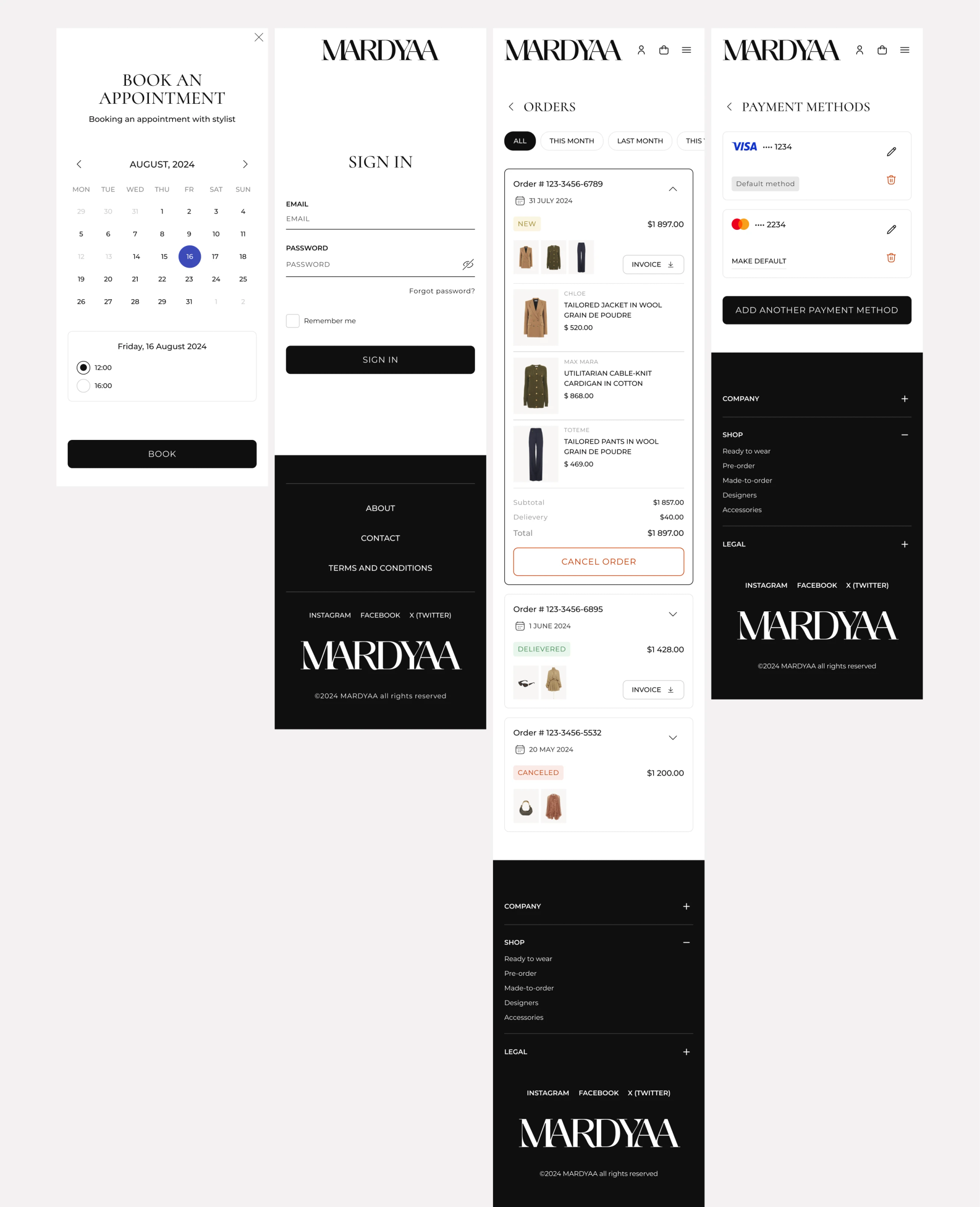
Members book a session with a stylist in a simple calendar, see what their membership gives them, track orders and keep their cards in one place. The account even greets them by name. We wanted it to feel like the back room of the boutique, where the staff know you.
Design System and UI Kit
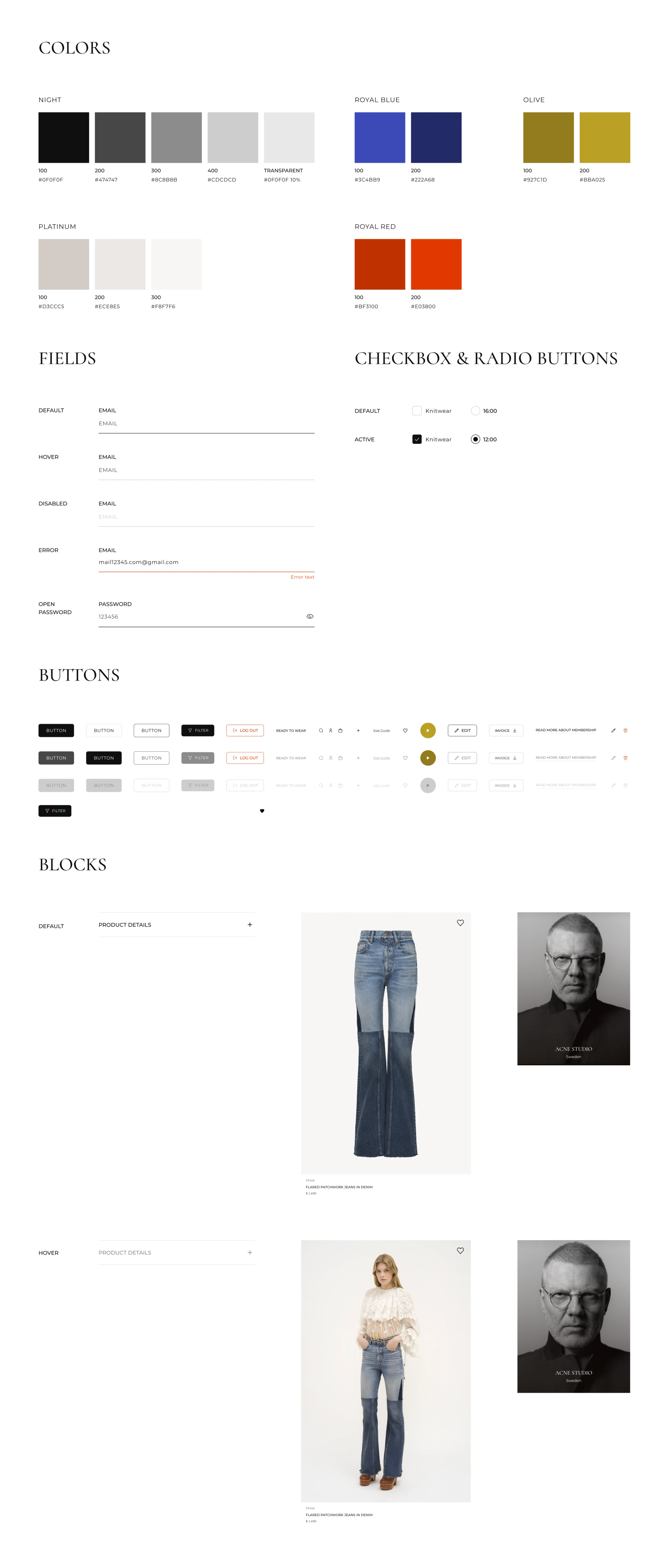
Before handing the design over to developers, we collected everything into one UI kit: the colour palette (Night, Platinum, Royal blue, Olive and Royal red), form fields, checkboxes, buttons and product cards. Every element has all of its states drawn out, so nobody has to guess what a disabled button or an error message looks like.
New pages are built from the same parts. The store stays consistent as it grows, and the developers save a lot of time.
Mobile Interface Design
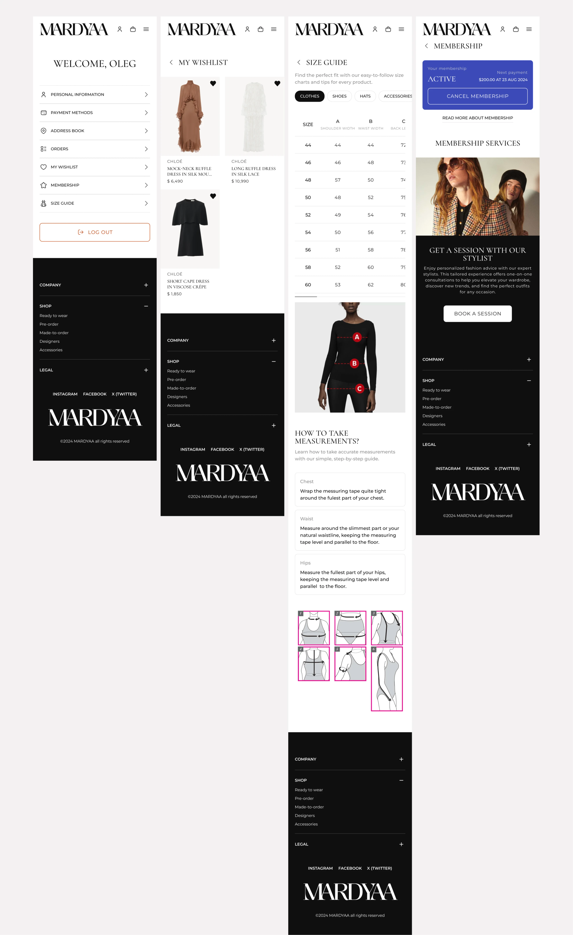
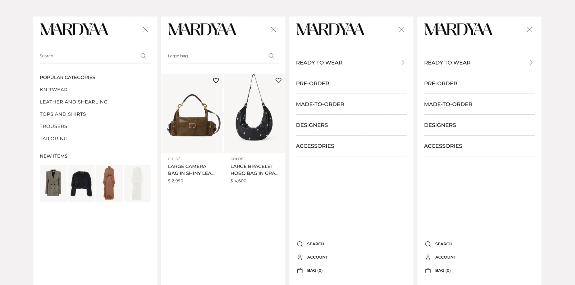
People shop for luxury on their phones as much as on a laptop, so the mobile version is not a cut-down copy. Everything is there: the campaign homepage, designer pages, filters, the size guide with measuring tips, stylist booking, orders and saved cards.
We kept the photos large and the controls within reach of the thumb, so the store still feels like Mardyaa on a small screen.
Approach
Moodboard
At the beginning of every project, before we start any design work, we create a moodboard. This helps us establish a shared visual understanding of the final result and define the direction in which we want to develop the concept.
High-fidelity wireframes
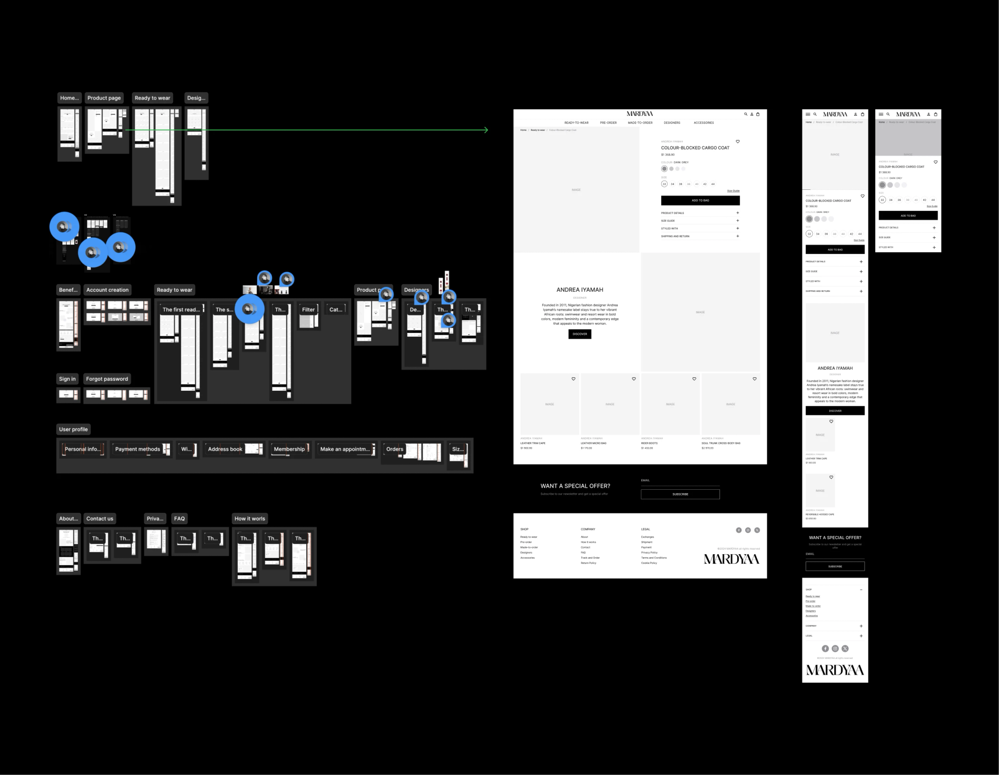
At this stage, we focus on creating a clear and intuitive UX and defining the layout. We also pay close attention to the content that needs to be placed on each page and within individual blocks.
UI & Visual Aesthetics
This is probably the most anticipated stage for any client. This is where the visual aesthetics of the future product begin to take shape. We explore different concepts and develop the chosen direction into a complete visual language for the product.
UI Kit / Design System
This is the final stage of the process. Here, we finalise all design materials and prepare the complete set of components and guidelines to be handed over to the development team.
Have a clear brief
or just an early idea?
Reach out either way. We’ll help you structure your thoughts, define the task, and bring your project to life.