
Swiss Value Club — Logo and Brand Passport
Overview
About
Swiss Value Club is a community of like-minded people and partners: investors, companies and the people shaping progressive markets.
The club needed a logo that carries confidence and success, plus clear rules so the brand looks the same everywhere, from a slide deck to a poster on the street.
Brief
Propose several distinct logo directions, show each one on real applications and develop the chosen one into a finished brand block.
The logo had to read well at small sizes, work on light and dark backgrounds and hold up in single-colour finishes such as varnish or embossing.
Everything needed to work with it went into one short document: the logo passport.
Client
Swiss Value Club
What we did
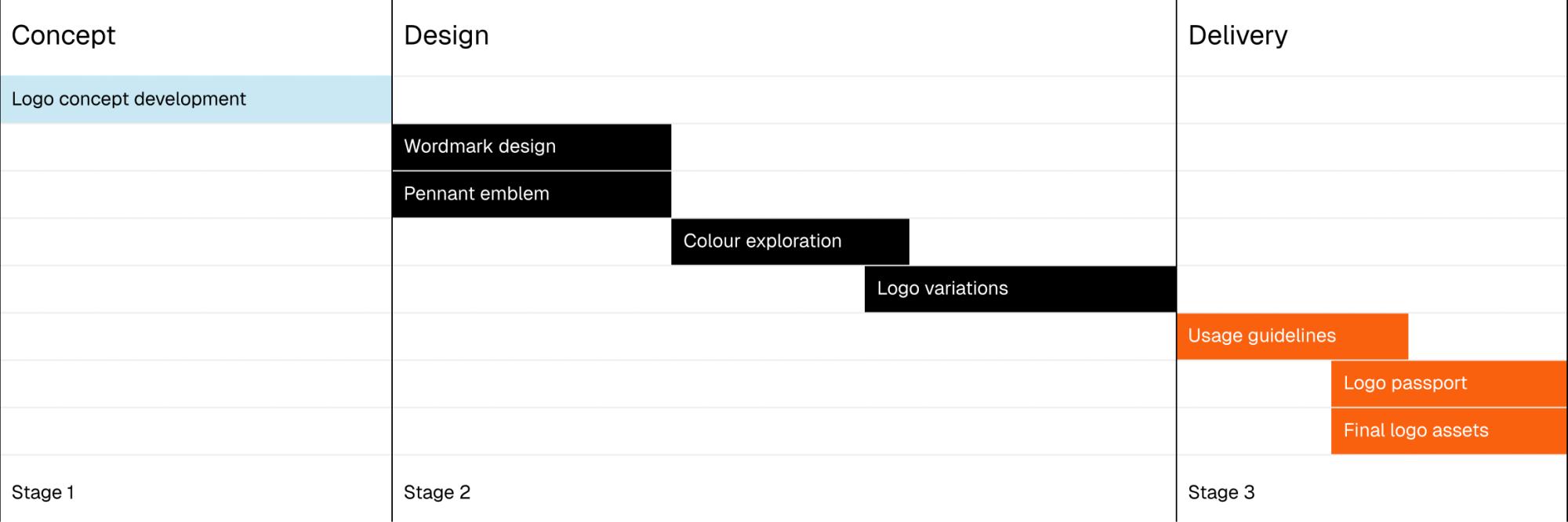
- Logo concept development
- Wordmark design
- Brand mark / arrow emblem
- Colour exploration
- Logo variations
- Logo usage guidelines
- Logo passport
- Final logo assets for digital and print
What you get
Several ideas to choose from
You start with five different directions. Each one is shown on light and dark backgrounds and on real applications, which makes the choice easier.
A logo for every surface
A main version for light backgrounds, an inverted one for black and a single-colour one for varnish, embossing and other finishes. Final files for screen and print.
Rules anyone can follow
Clear space, minimum sizes and examples of what not to do. Your team, a printer or a new designer can find the answer in the passport without having to ask you.
Colours and type
Core and supporting colours in HEX, CMYK and HSB, with Oracal and RAL codes for the core set. Two brand typefaces, plus Arial as the fallback for Word and Excel.
Workflow
Five concepts
Our approach
Every direction starts from the same thought: the logo should express what the brand stands for and work as a metaphor for success. Most pair an emblem with a strong, confident typeface for the name. One relies on an abbreviation.
How we presented them
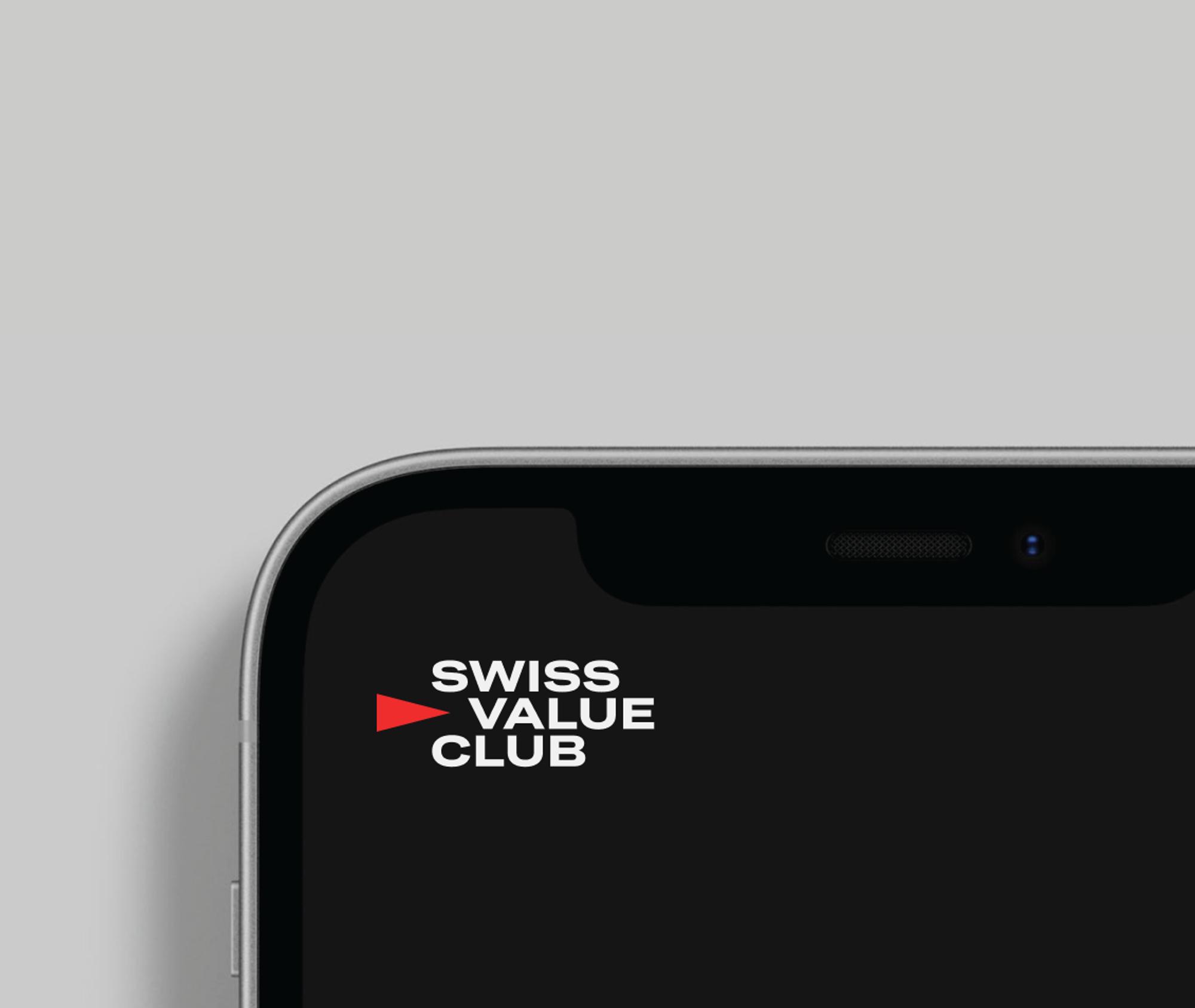
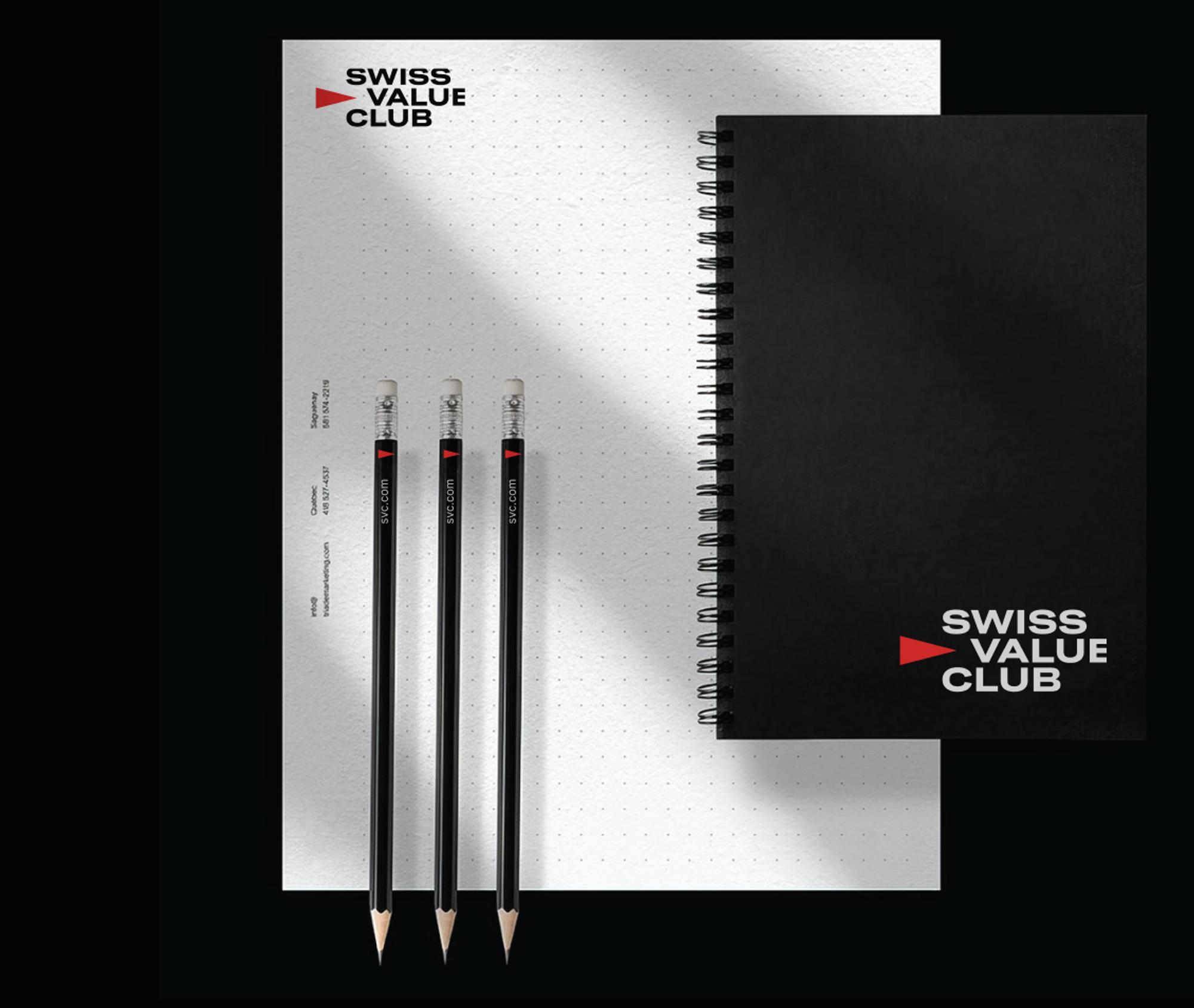
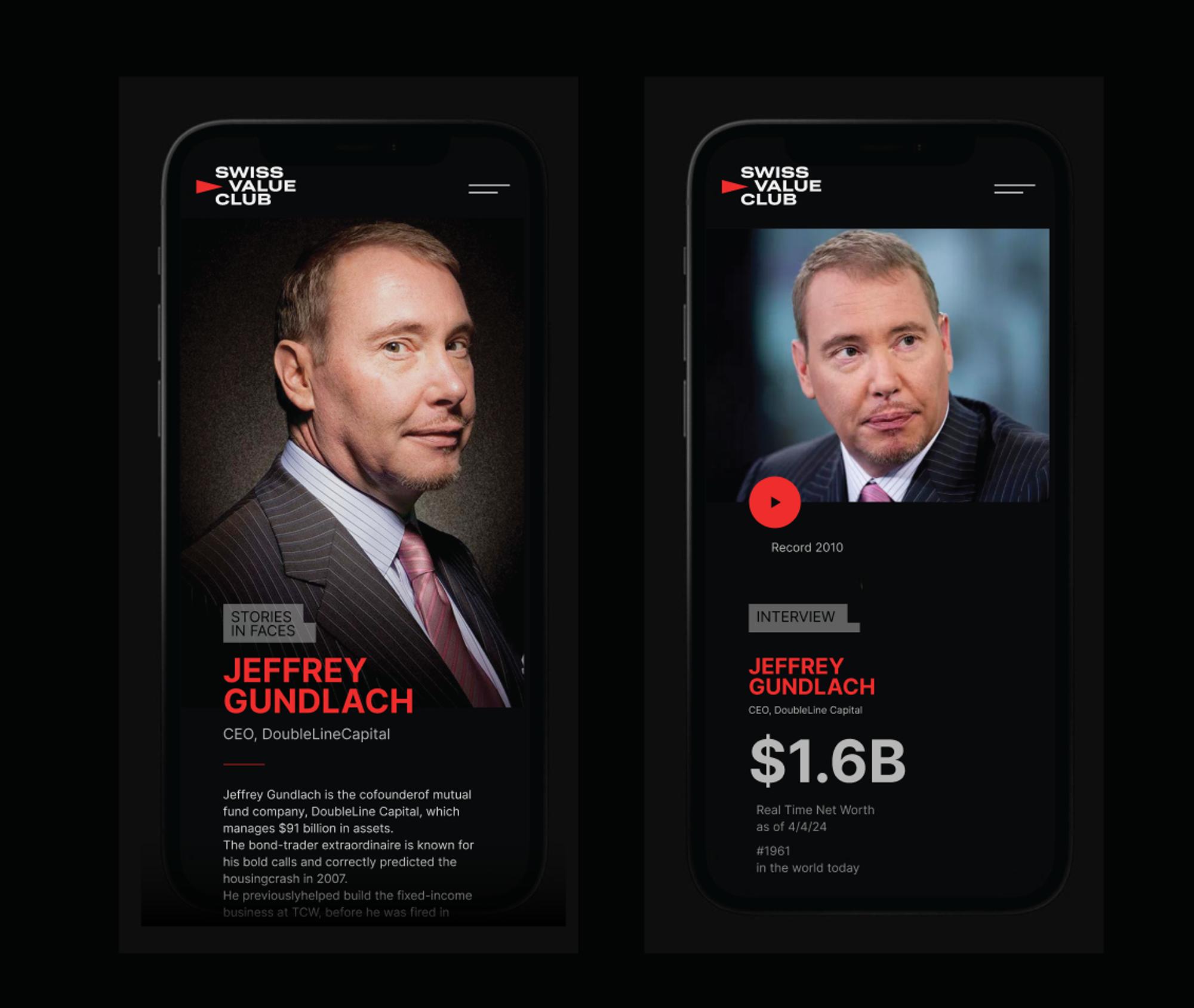
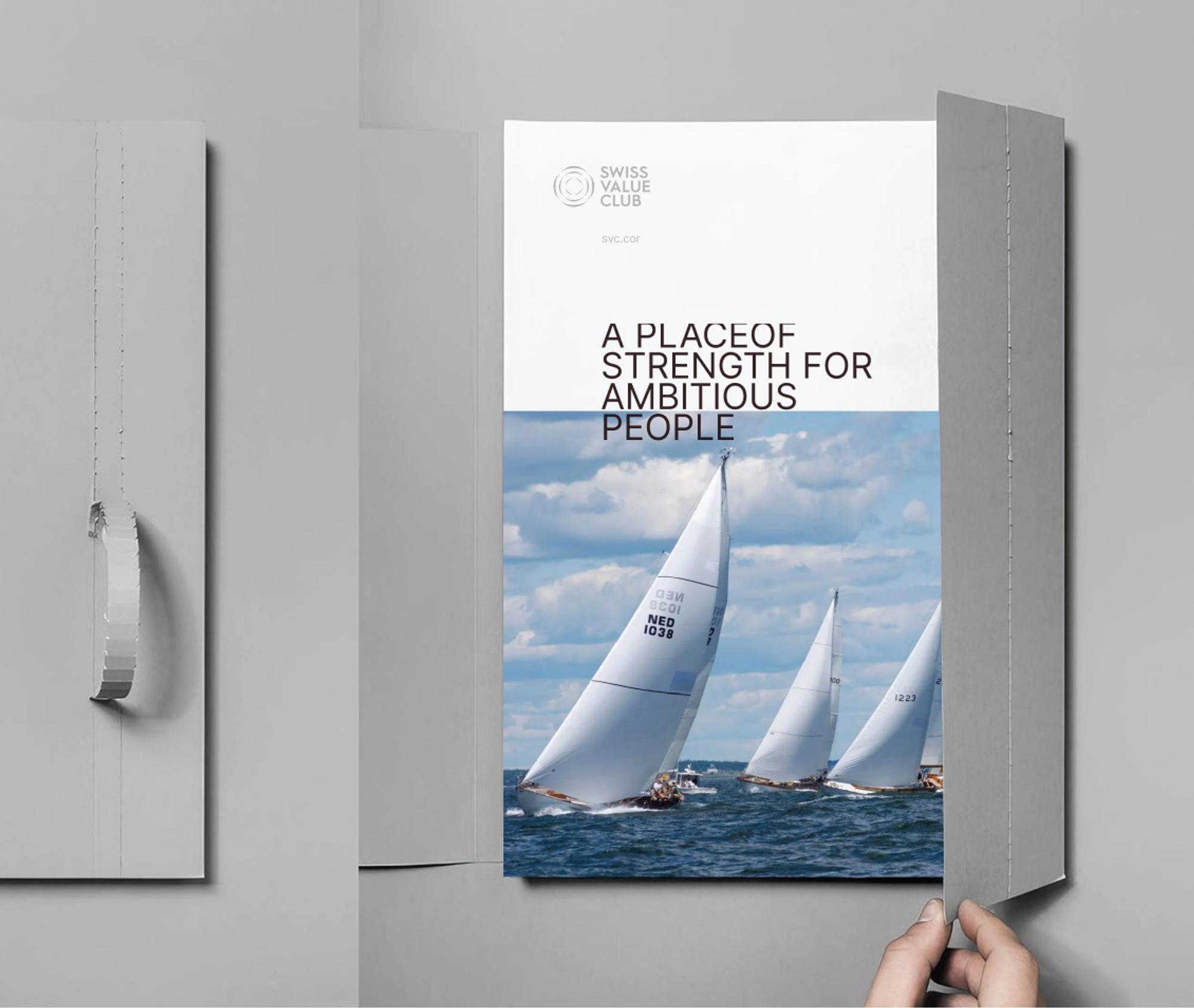
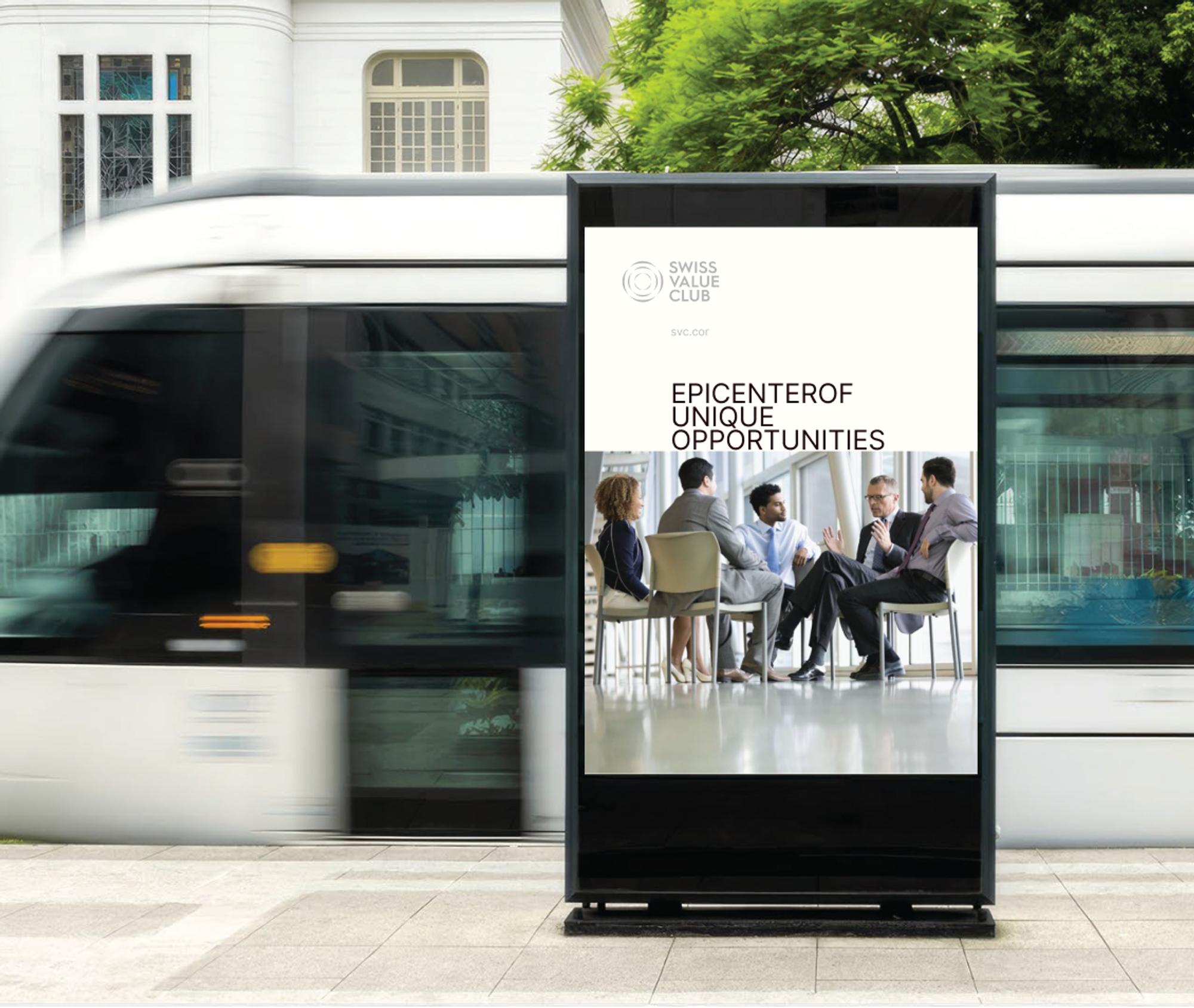
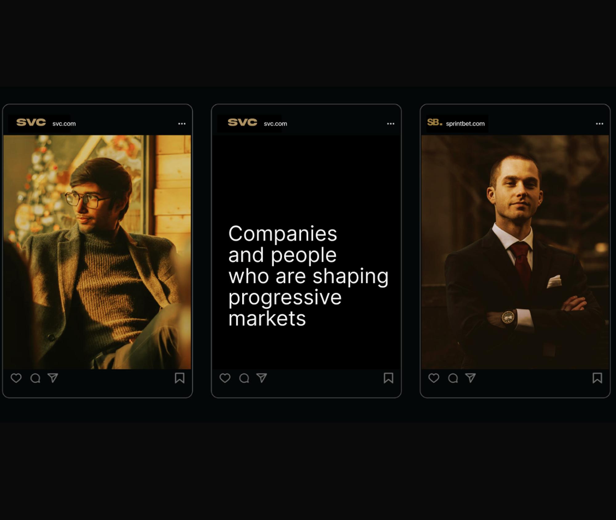
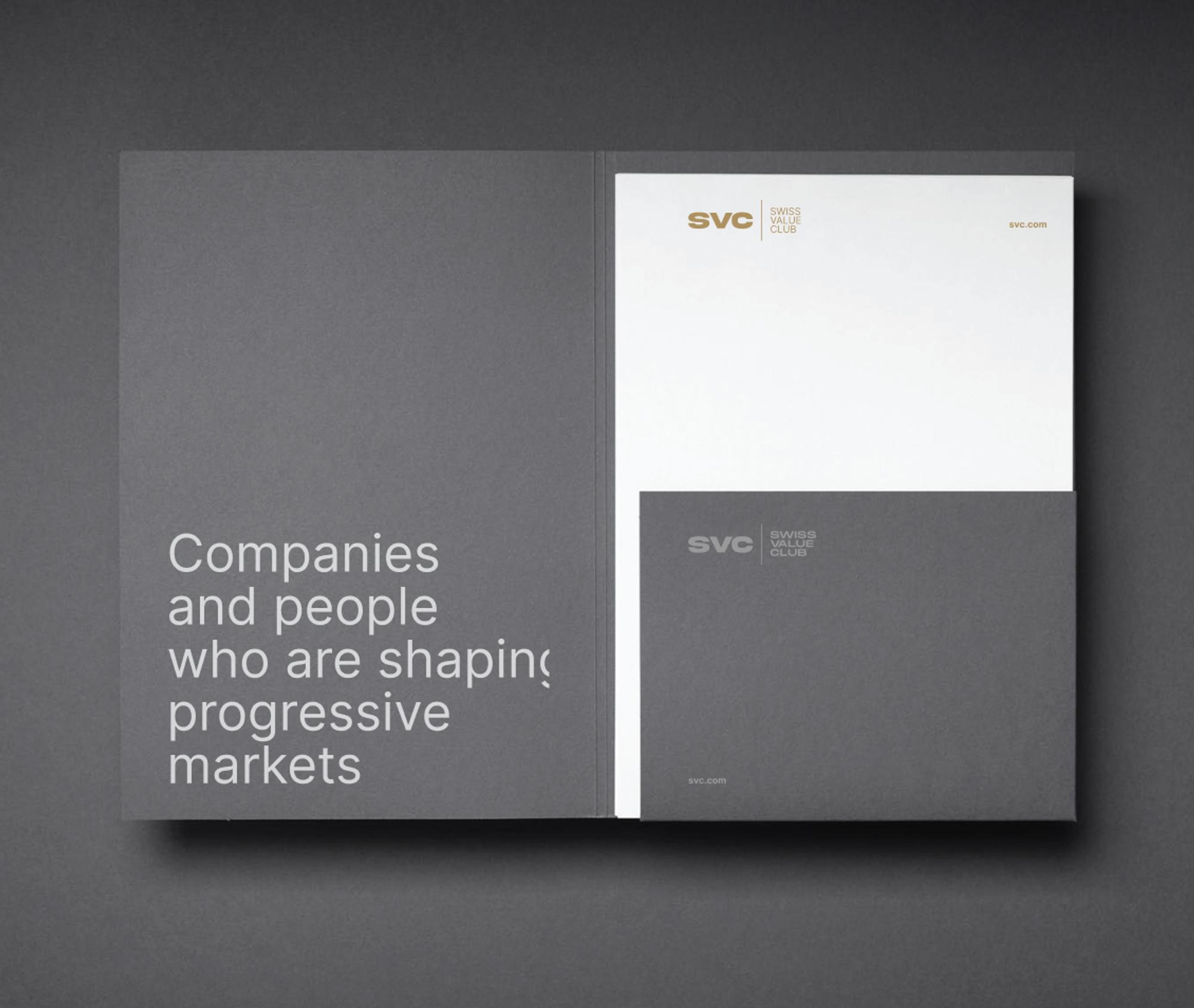
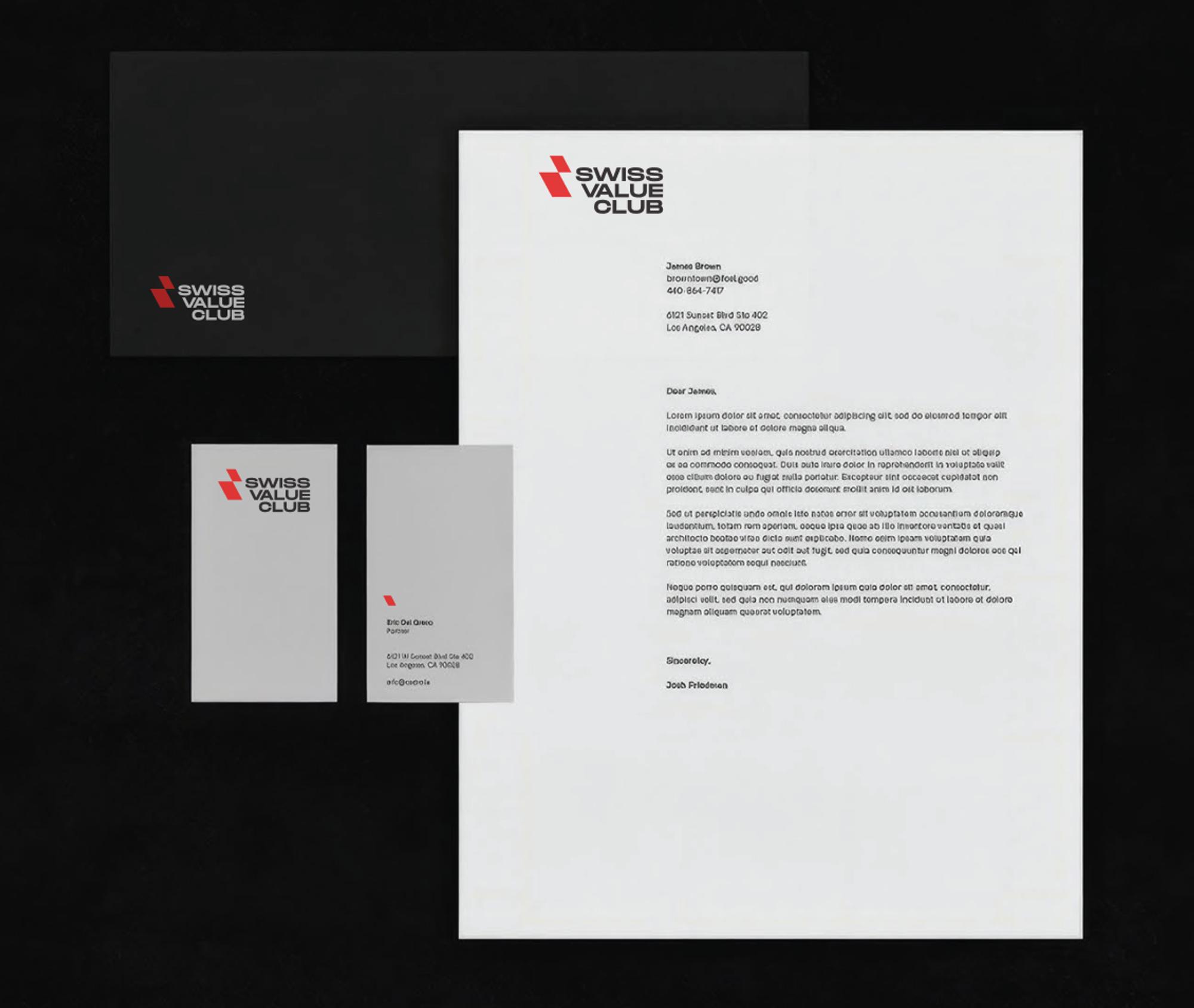
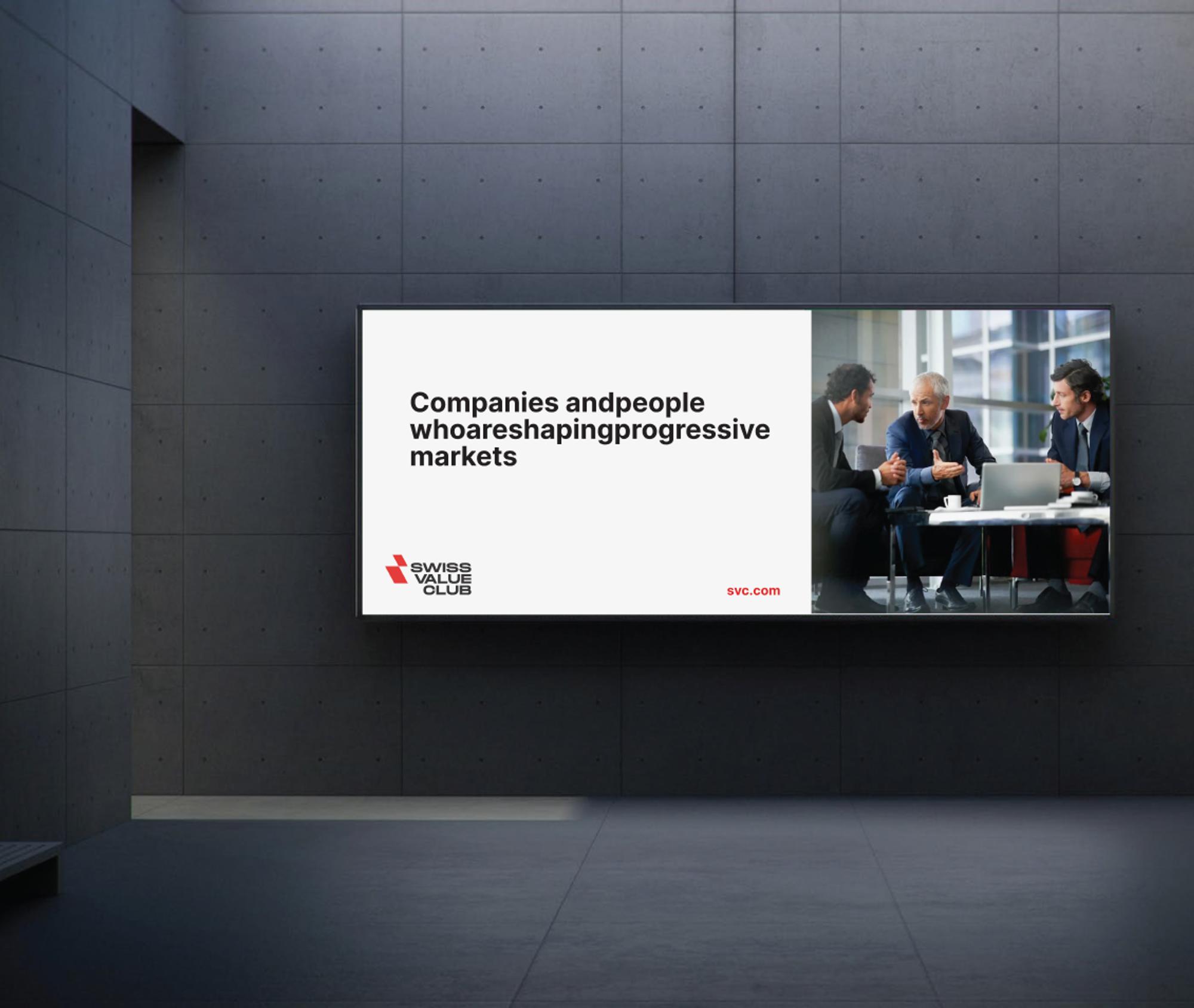
The client saw each concept on white and on black, then on a poster, a screen, stationery or social media. That makes a logo far easier to picture in real life than a single image on a white page.
Concept 01
Idea
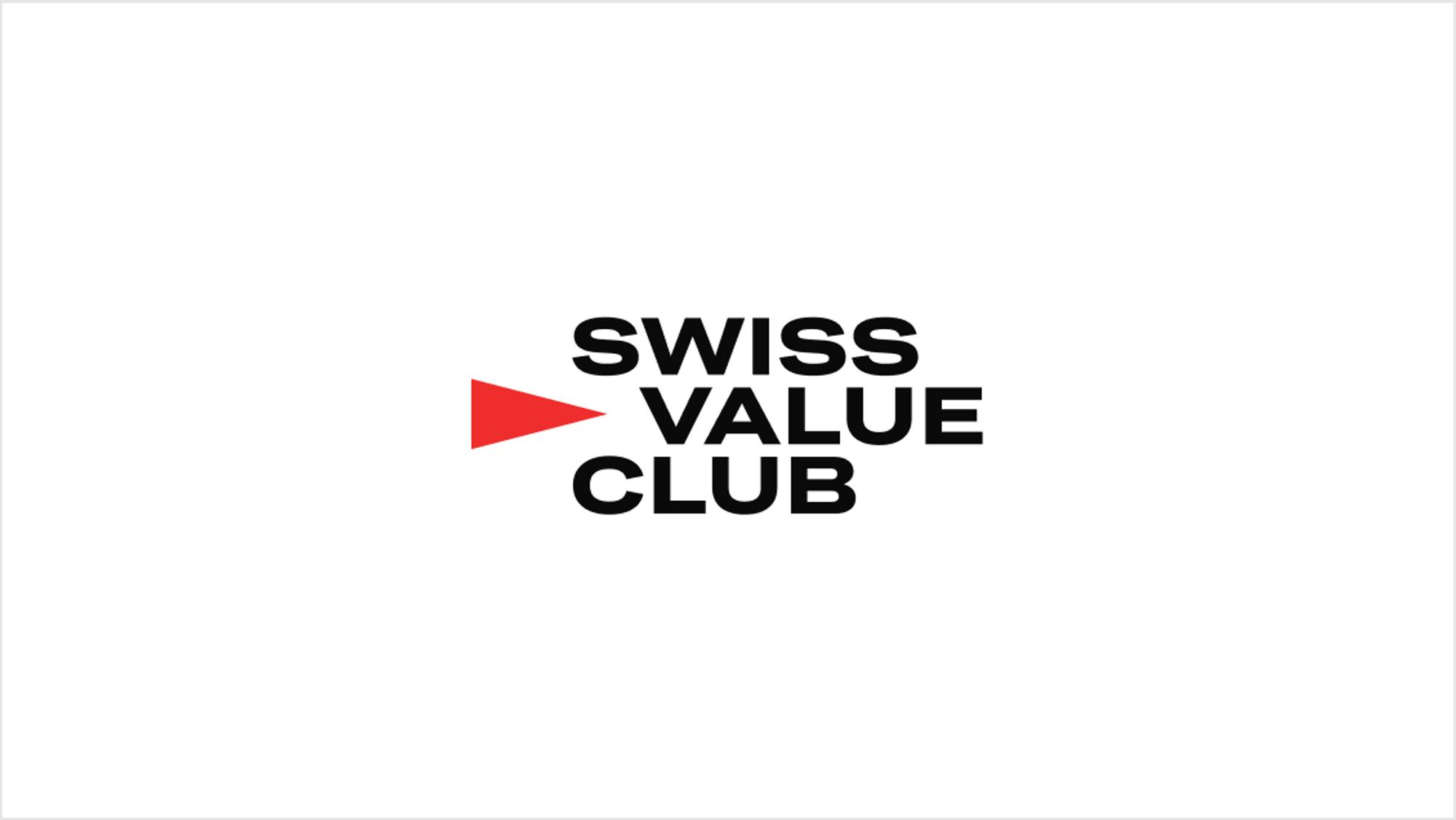
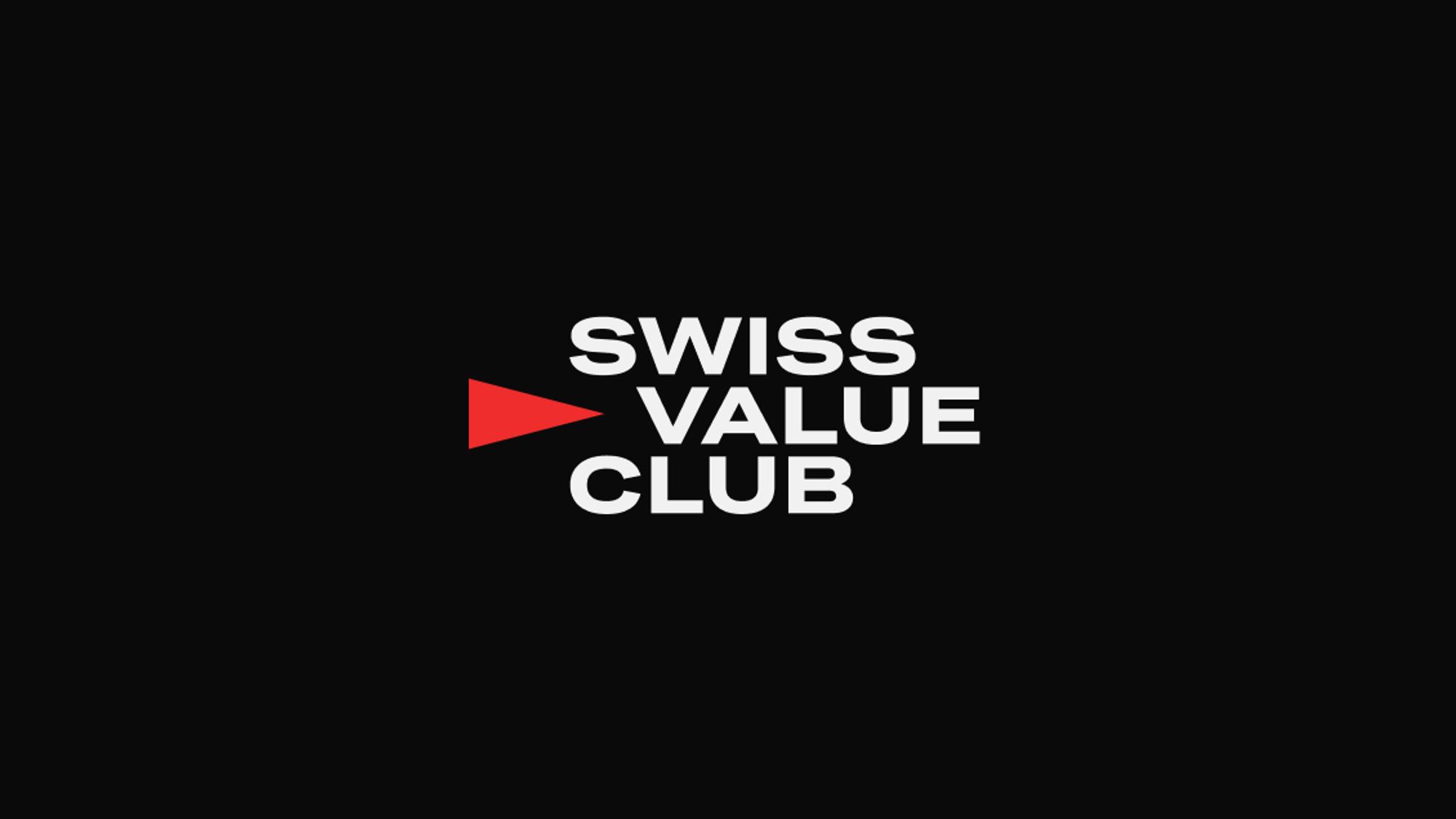
A touch of retro in the typeface, handled in a modern way. The emblem works as an arrow: a push that moves us, our achievements and our ideas forward.
A second reading
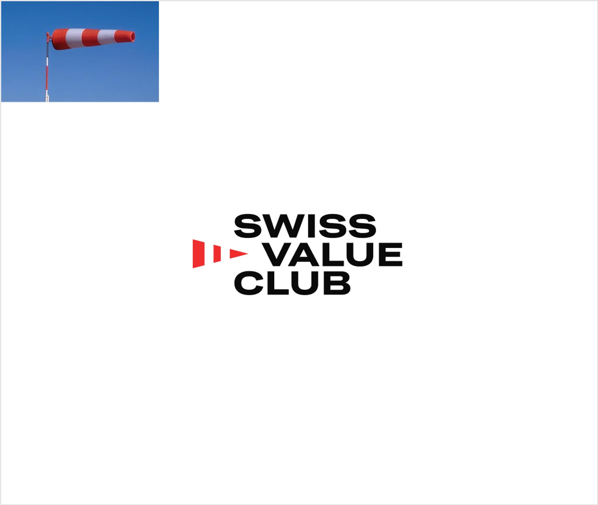
The same shape can also be read as a windsock at an airfield, filled with wind. It shows the direction and strength of the wind, and readiness for the next flight.
A variation
We also showed a version with two white stripes, which makes the windsock link explicit. The logo works just as well without the hint.
Concept 02
Idea
A simple metaphor: arrows or birds reaching for flight, growth and development.
Type
We paired the emblem with a mixed typeface of sharp and flowing shapes, so it feels both crisp and soft.
Concept 03
Idea
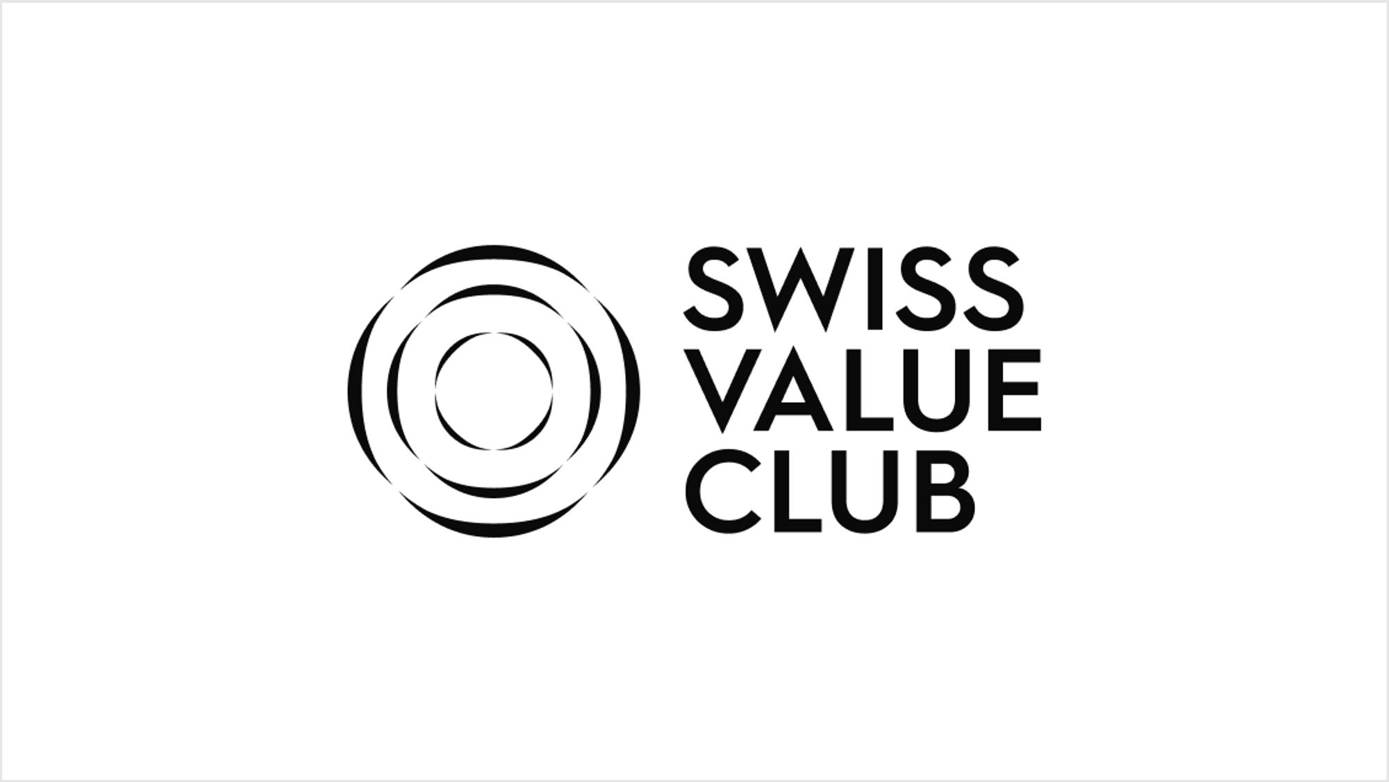
A classic combination: a large emblem with a strict but light typeface for the name.
Emblem
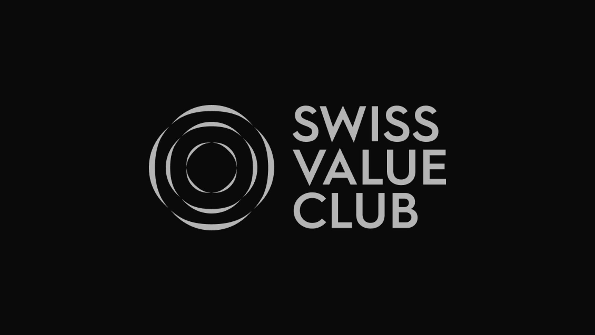
It can be read as a target, standing for precision and moving towards a goal. Or as a growing community: ripples spreading across water.
Colour
On black, the logo appears in a refined silver.
Concept 04
Idea
An abbreviation and the full name, separated by a vertical line.
Colour
On black, the mark turns brass.
Concept 05
Idea
The emblem hints at the tail of an aircraft.
Type
The name is deliberately set ranged right, so it reads as a continuation of the fuselage.
The chosen logo
The decision
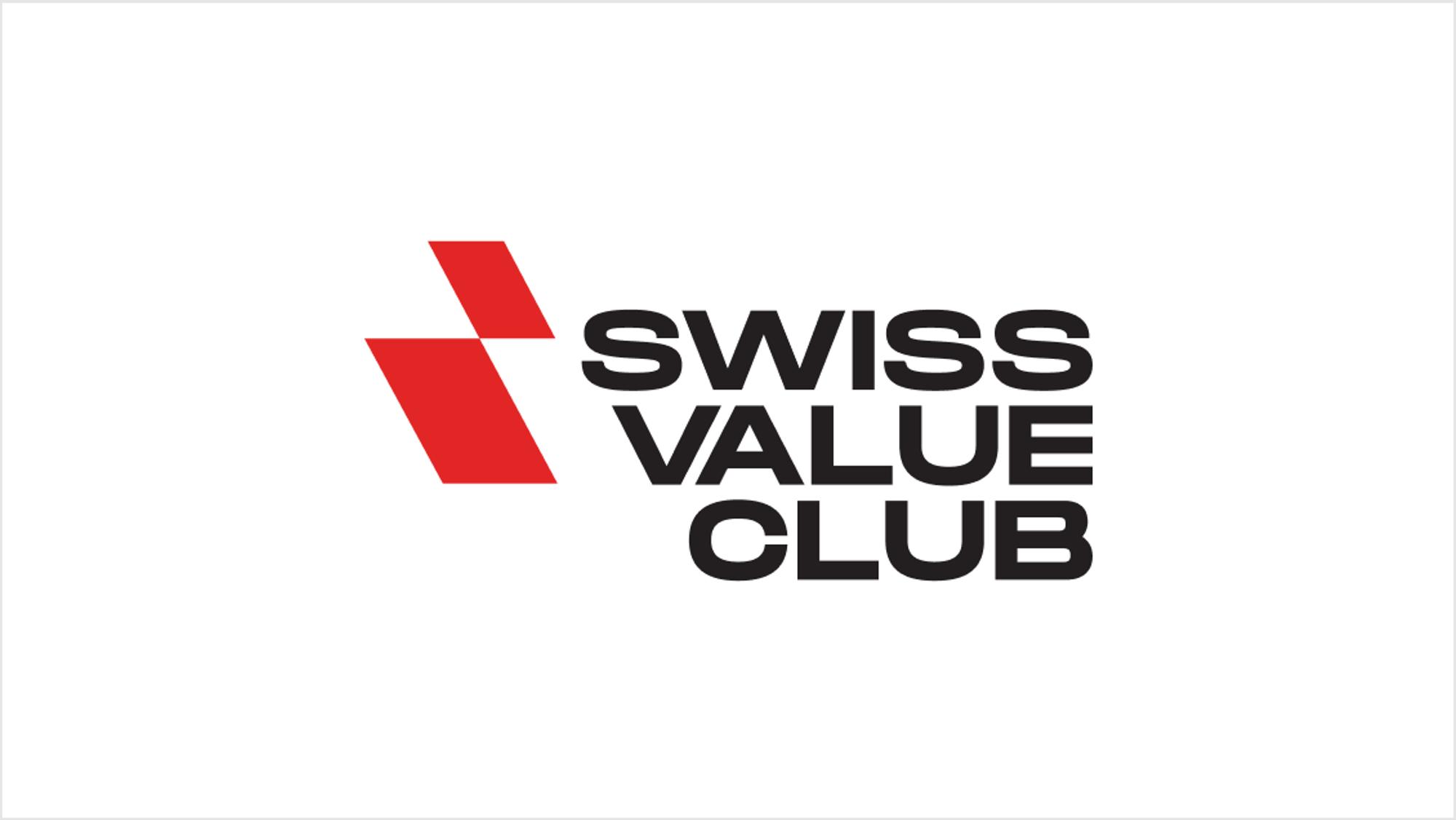
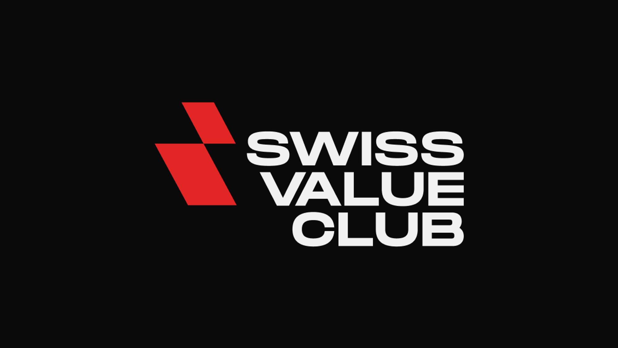
The client chose Concept 01. We then developed it into a brand block and set out how to work with it.
The brand block
The logo is a single unit: the emblem and the name are only used separately in special cases. The name is set in Grtsk Tera Bold.
Versions
The main background is light. There is an inverted version for black (#0A0809) and a single-colour version for varnish, blind embossing and foil stamping.
The rules
Clear space
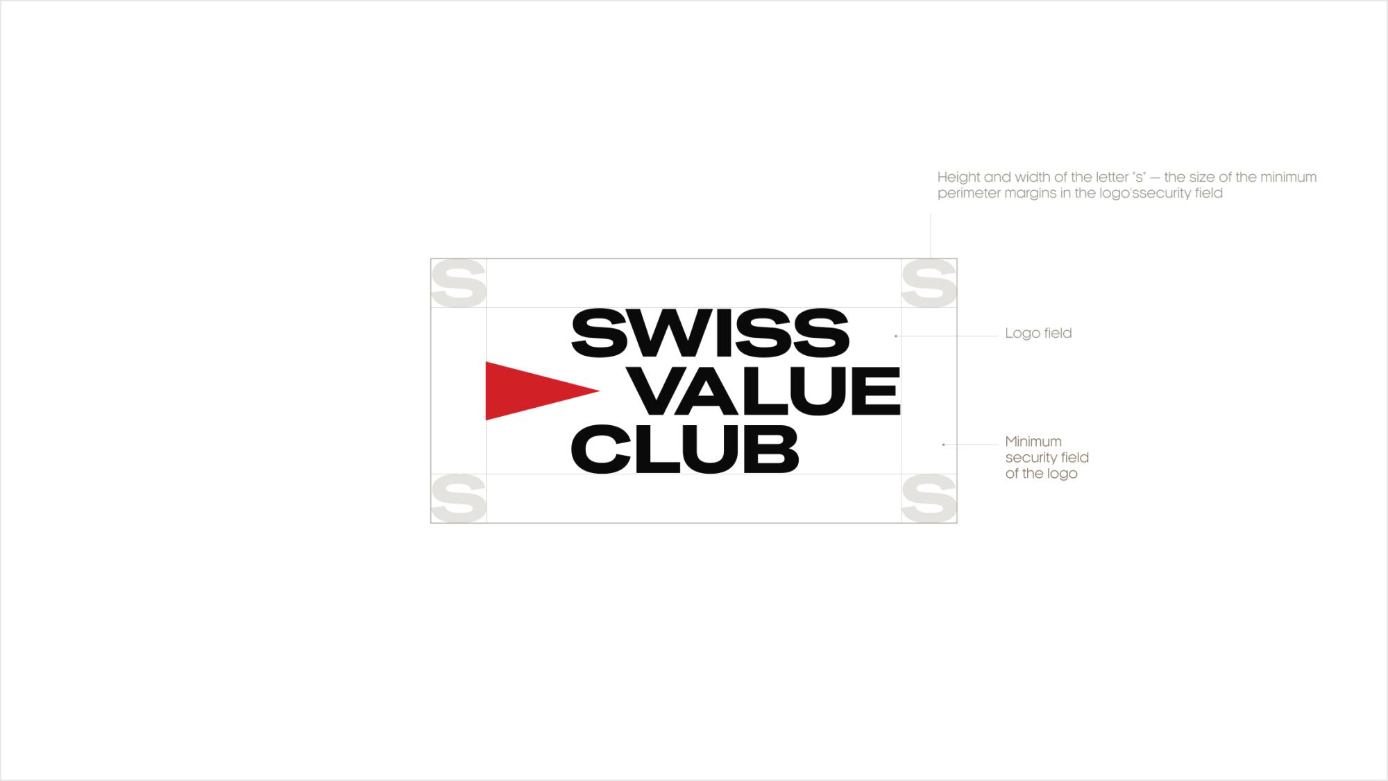
Nothing goes inside it: no text, graphics, photos or layout edges. The minimum margin equals the height and width of the letter “s”. The more room around the logo, the better.
Minimum size
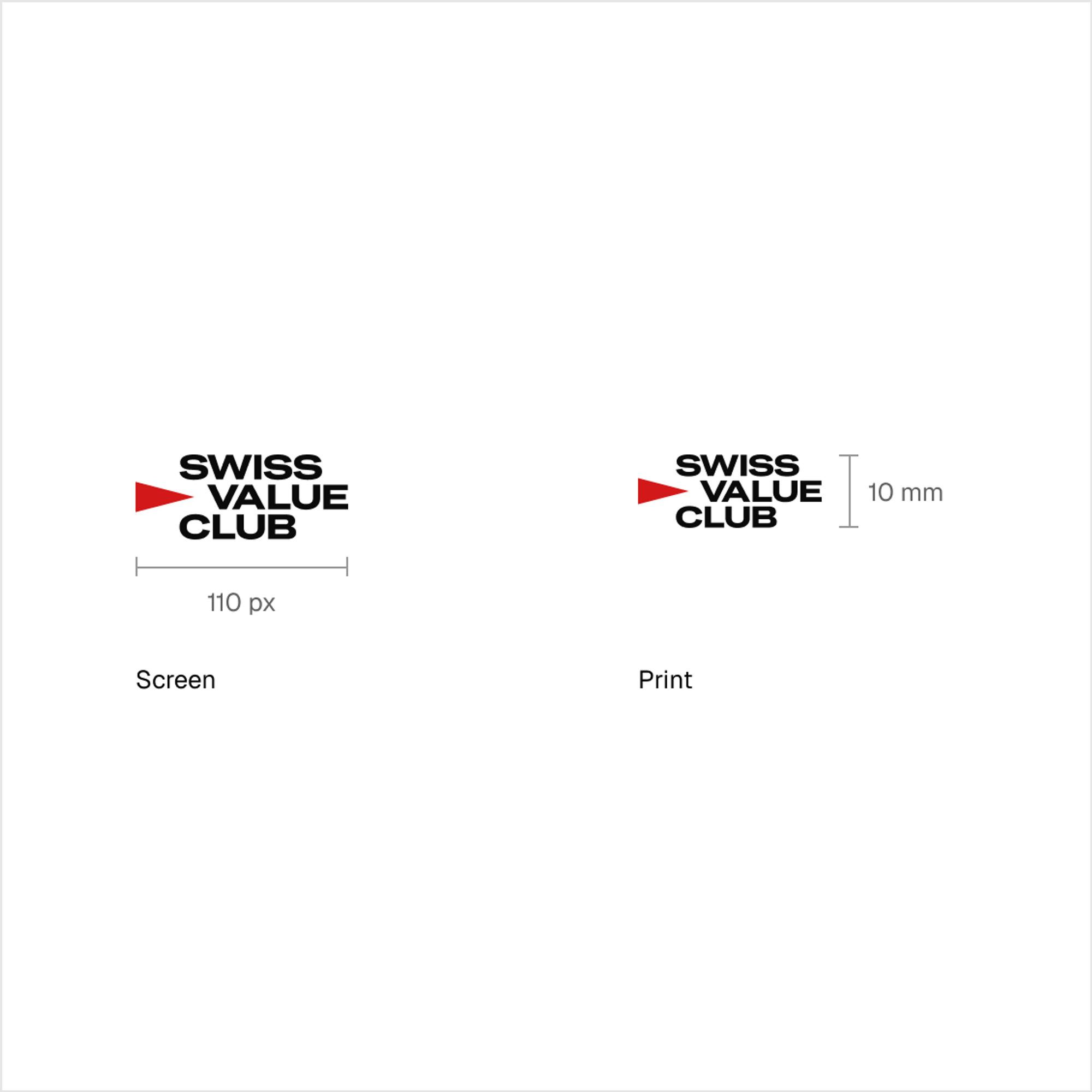
110 px wide on screens and 10 mm high in print.
The emblem alone
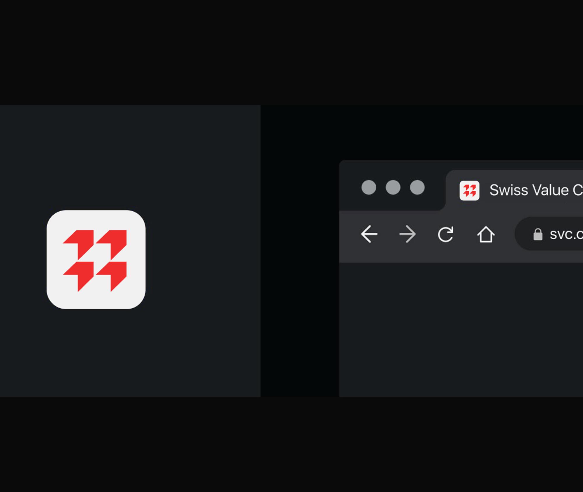
Only as a brand graphic and only in its original red. It doesn’t replace a bullet point, an arrow or a play button.
What not to do
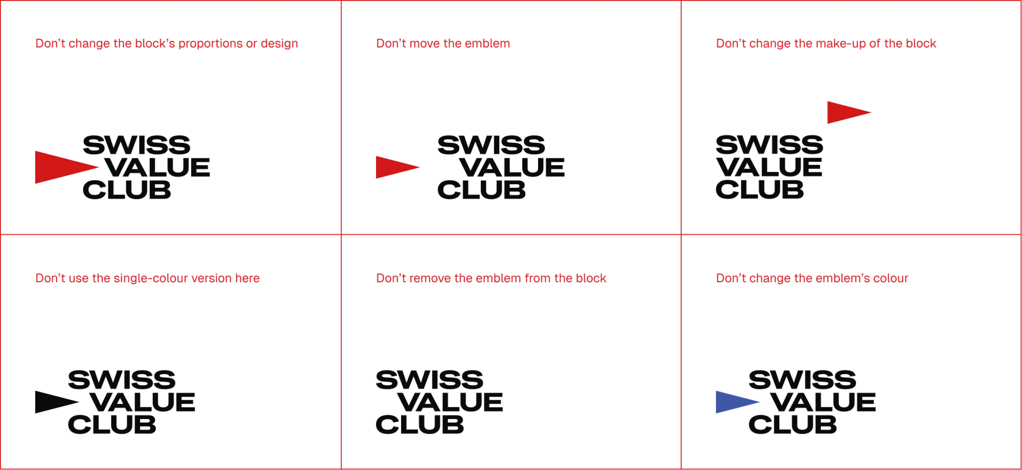
Six common mistakes are shown side by side: moving the emblem, changing the make-up of the block, its proportions or colour, or removing the emblem altogether.

Colour and type
Colour
Red, black and soft white do most of the work. Blues and warm neutrals cover short text, interface elements and print.
Type
HeliosExt Bold for headings and DM Sans for text. Arial takes over where the brand fonts can’t be installed, such as Word and Excel.
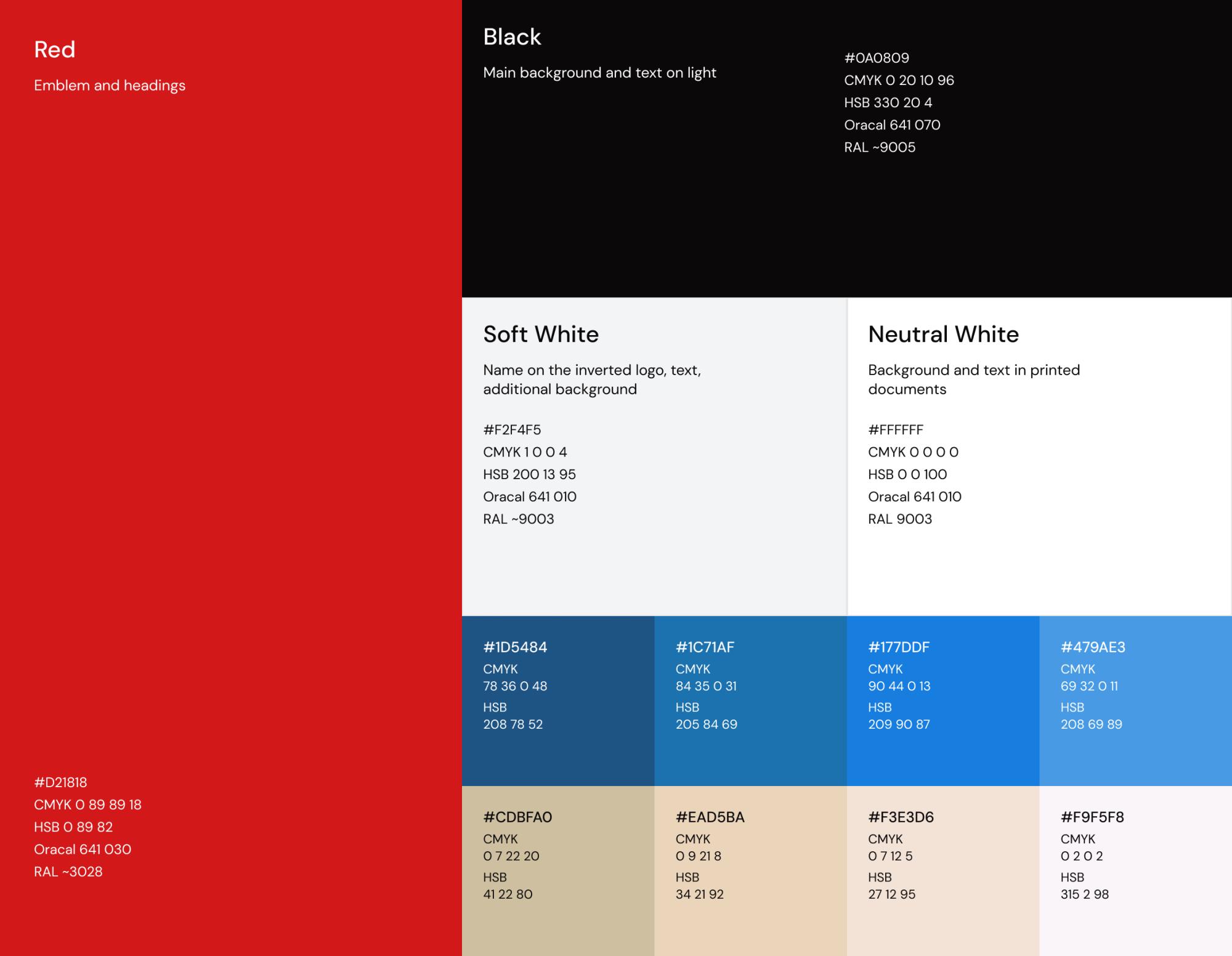
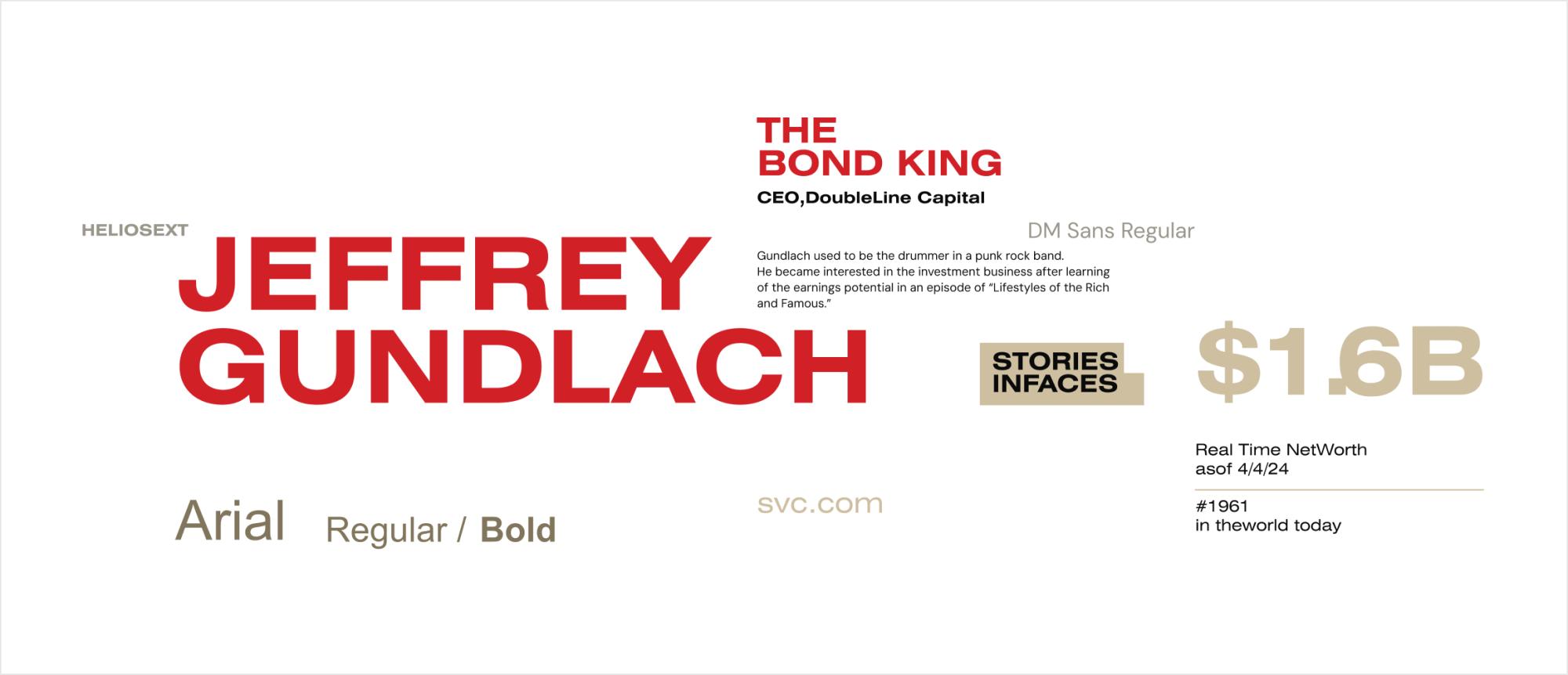
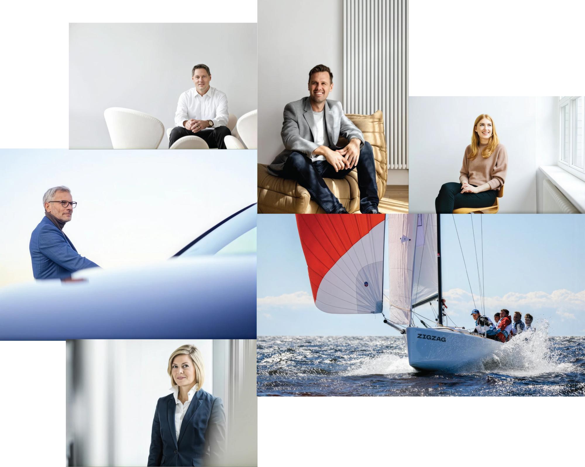
Photo style
Landscapes
Sky, clouds and mountains, with plenty of clean, light tone.
People
Preferably no formal business suits. Relaxed clothes, open faces and a calm atmosphere, on a light, clean background with little visual noise.

The logo in use
Examples
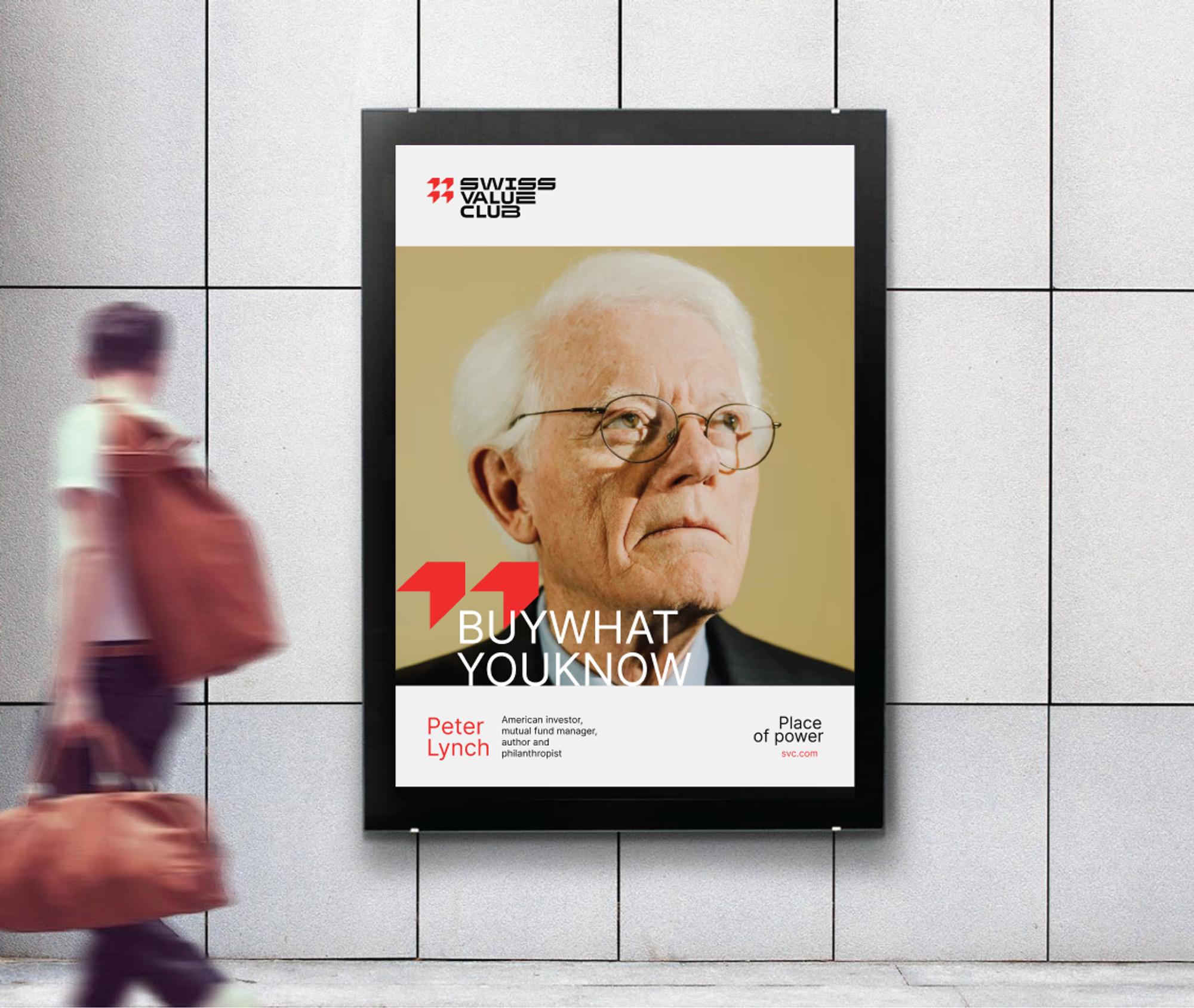
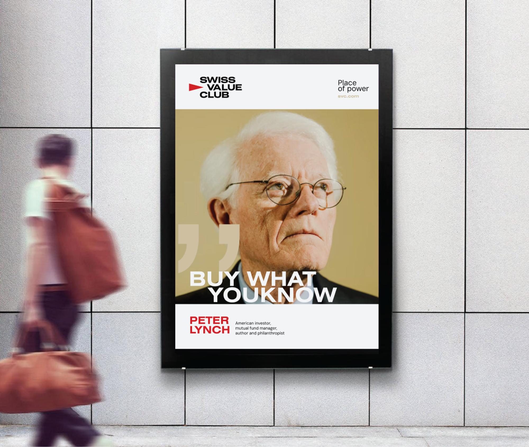
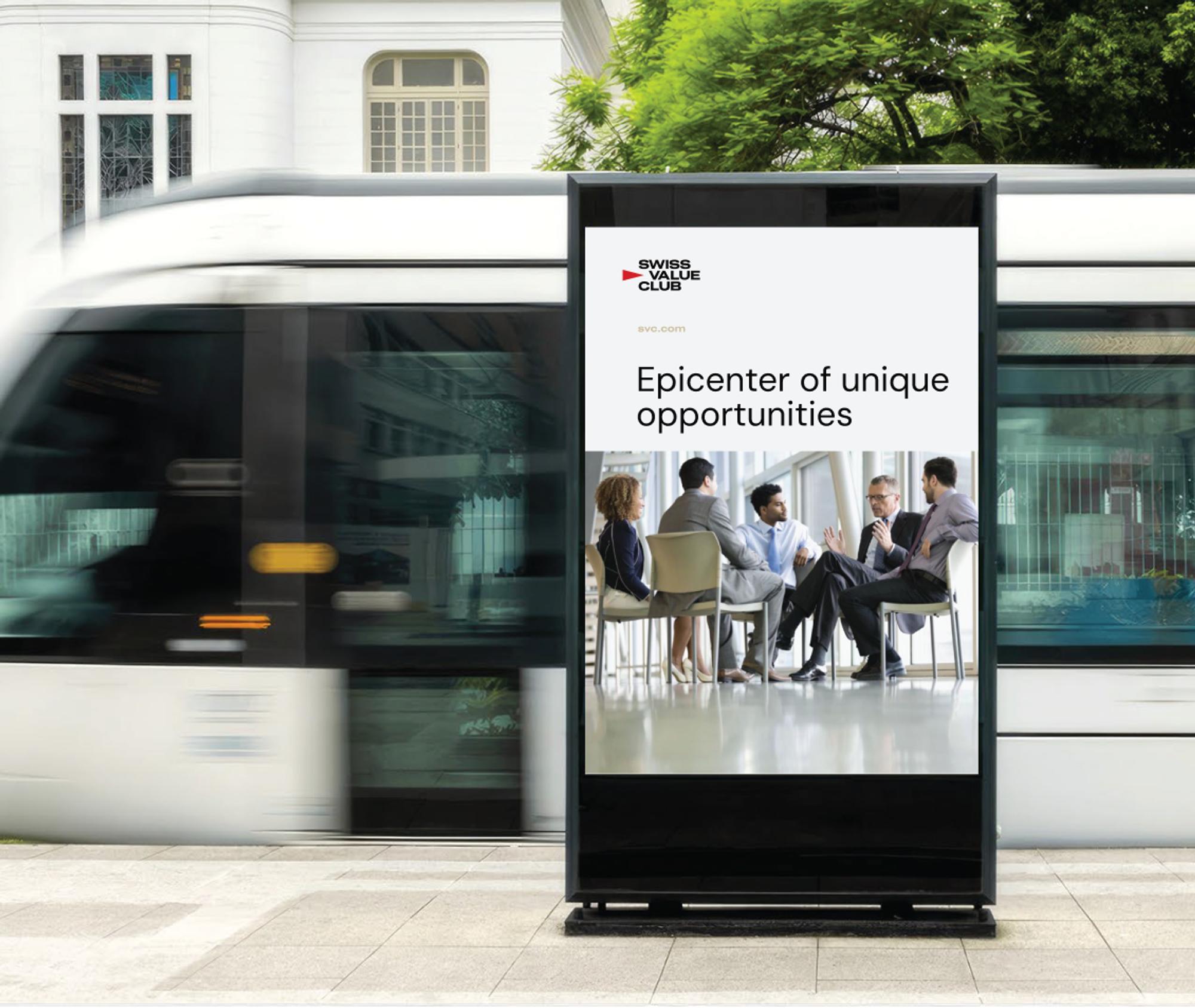
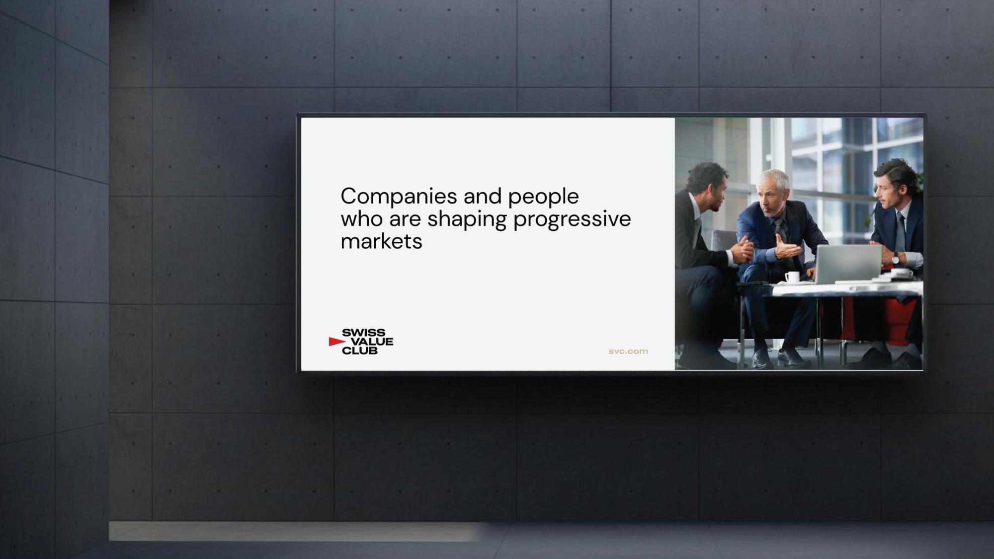
Three examples from the passport show how the logo, colour, type and photography work together on a poster, a street display and a large indoor screen.
Result
Outcome
The club came away with a finished logo and a 16-page passport setting out how to use it.
The same kit would suit any brand that is launching or tidying up its identity: one document with the logo, the rules and the files, so the brand looks the same however many people work on it.
Have a clear brief
or just an early idea?
Get in touch either way. We’ll help you shape the brief, define the scope and turn it into something real.